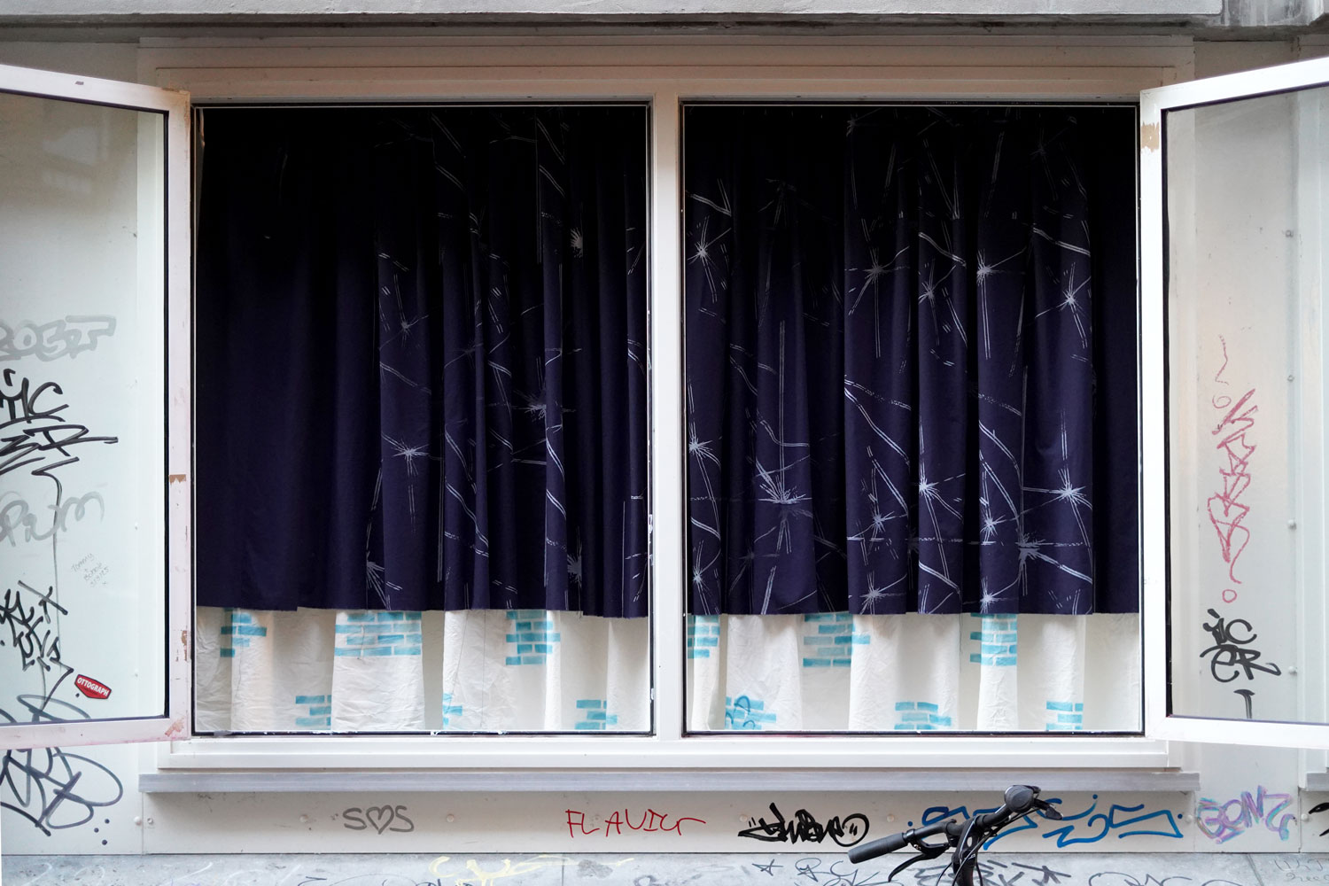
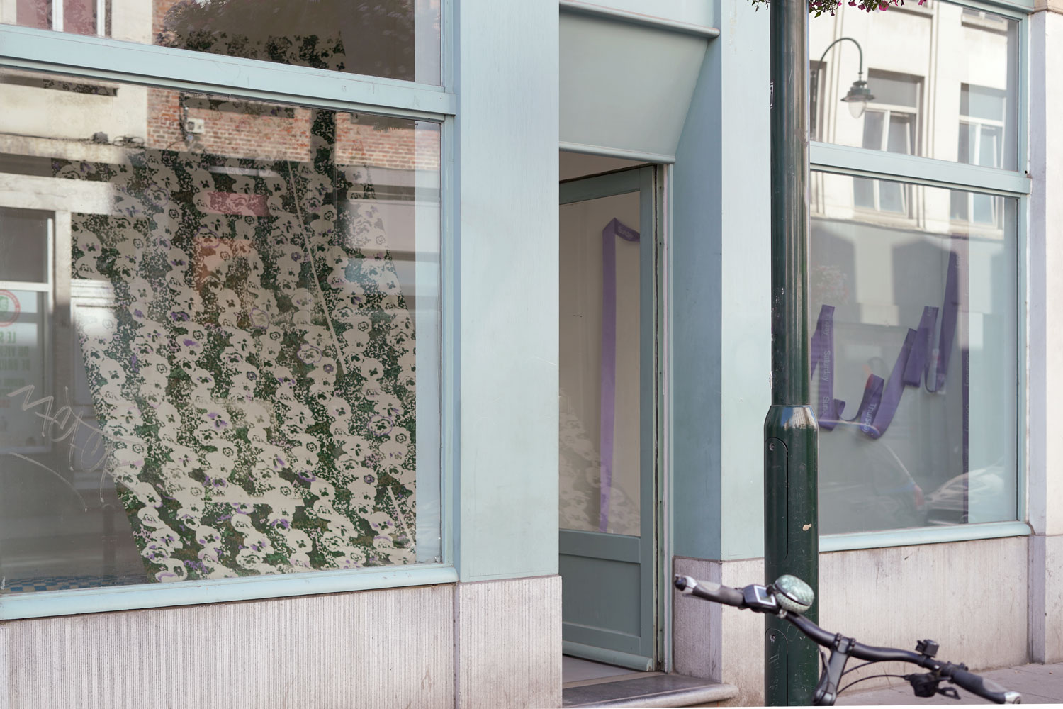
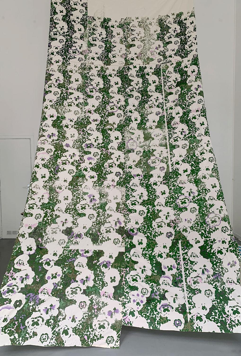
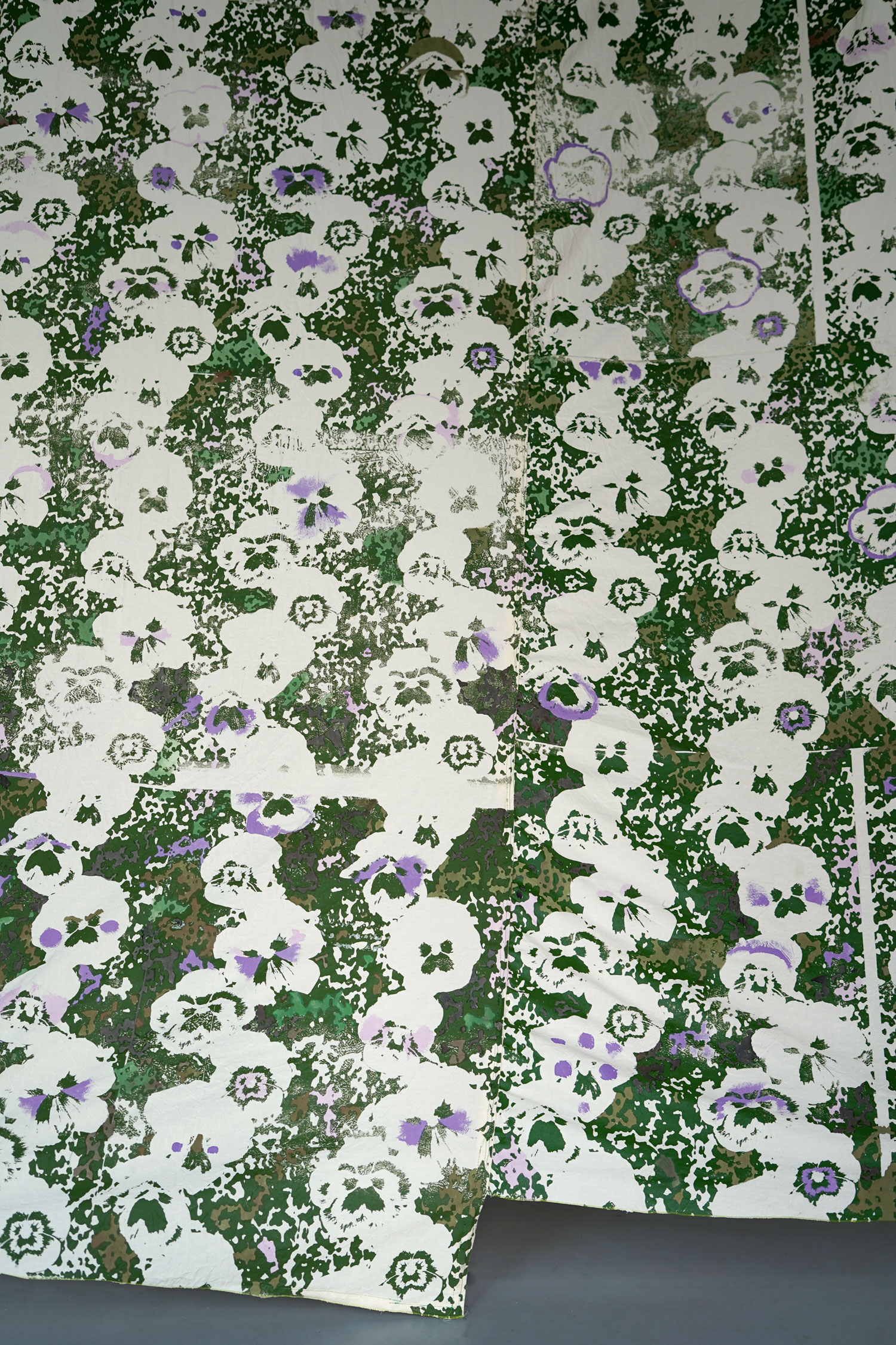
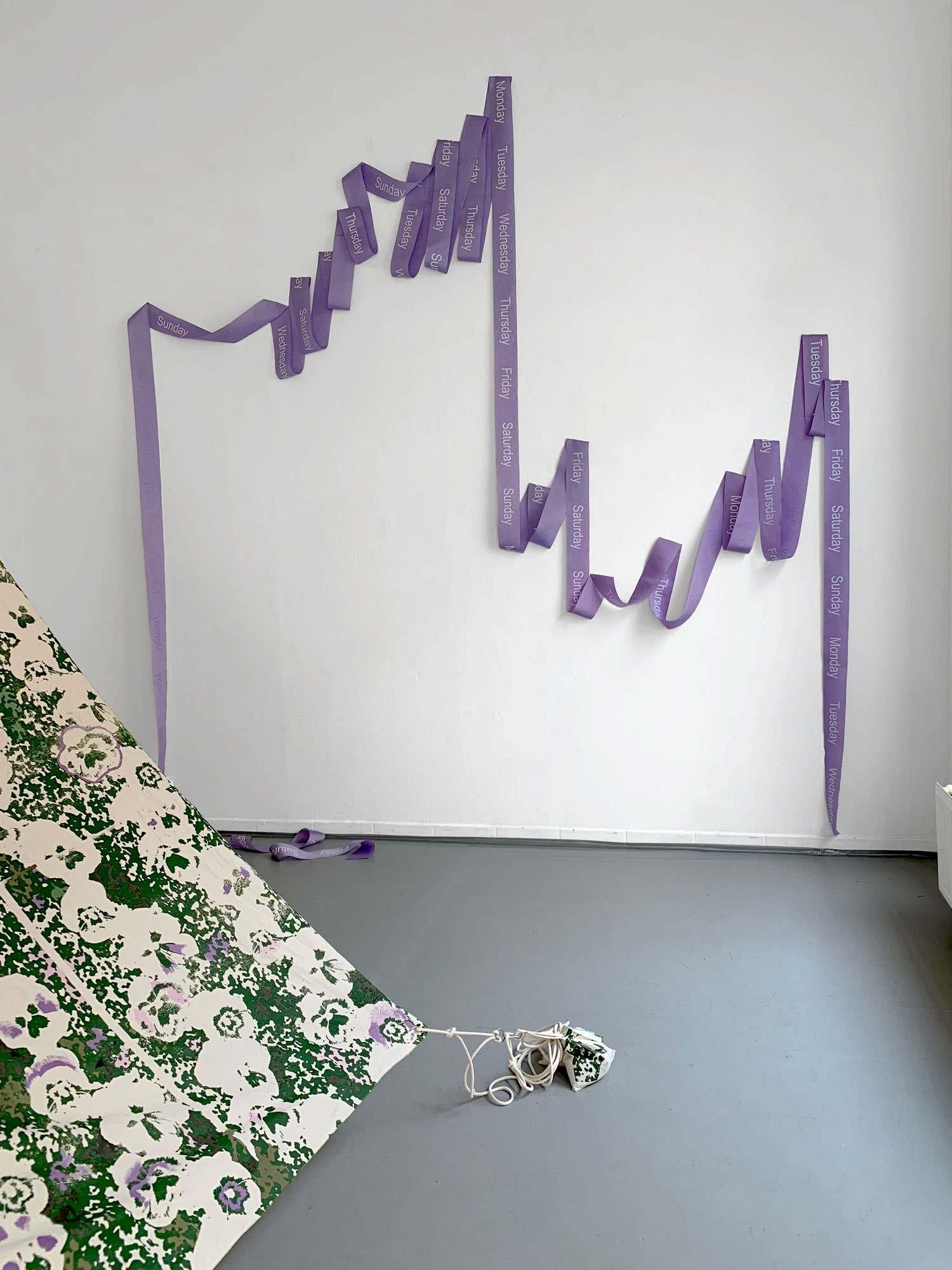
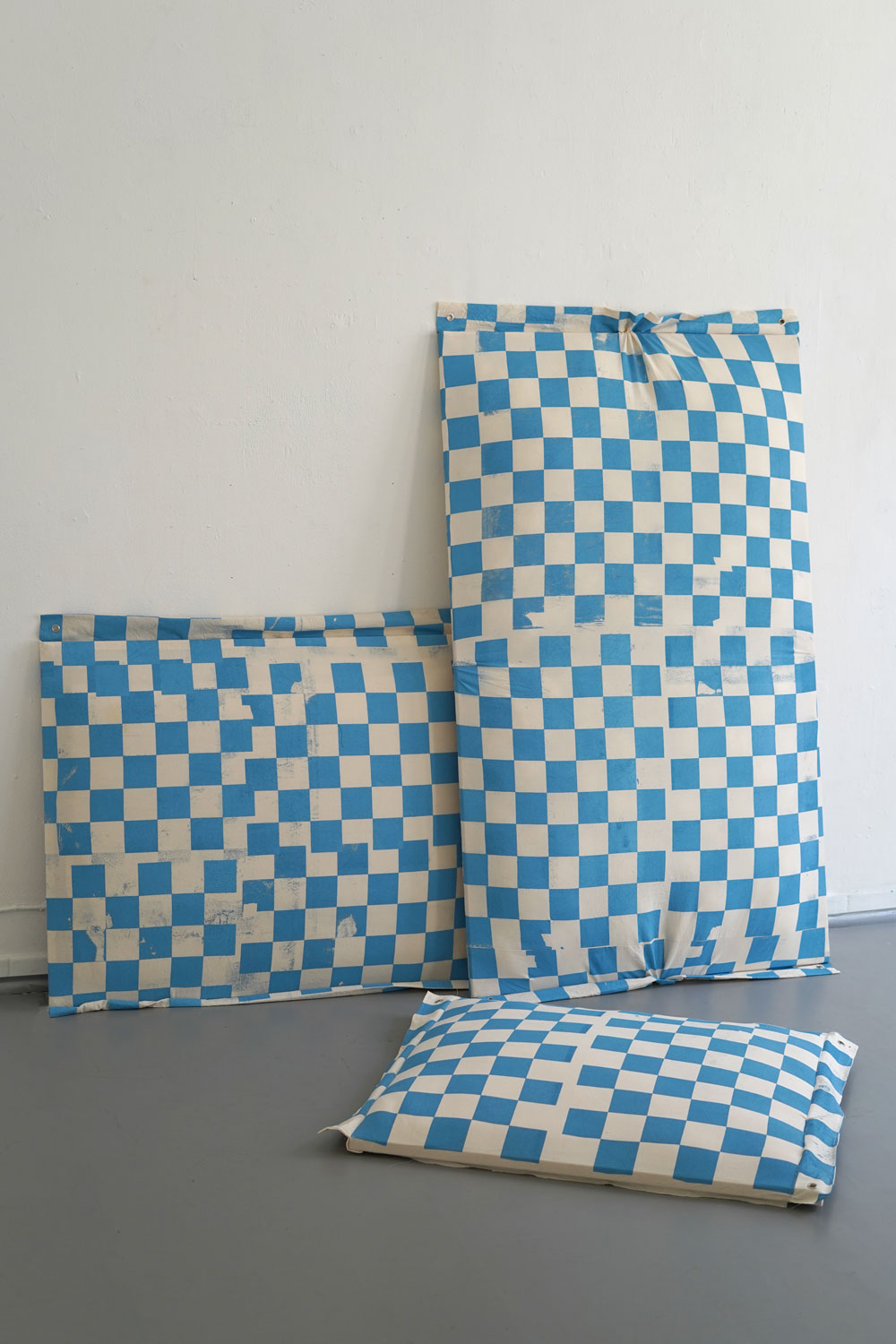
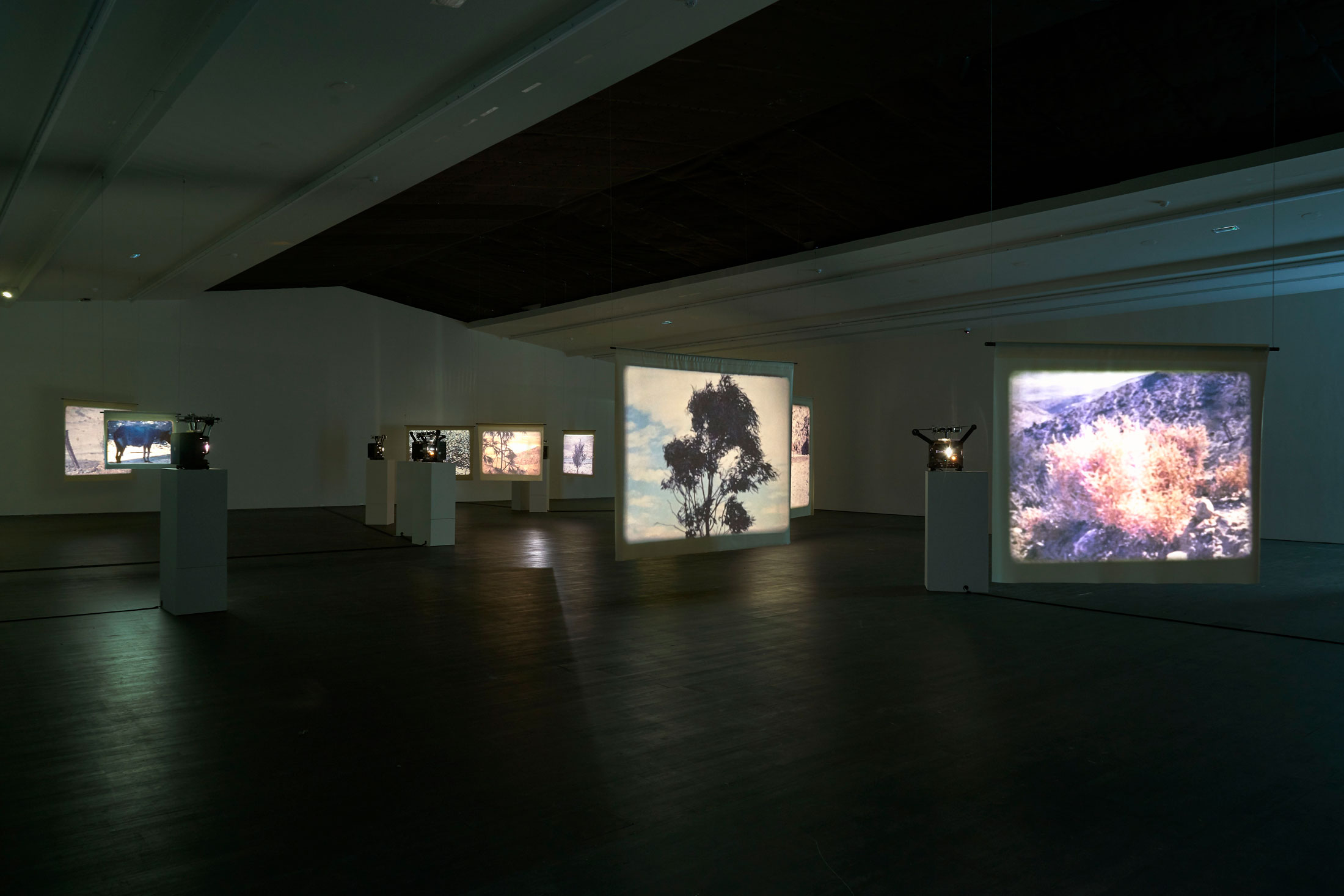
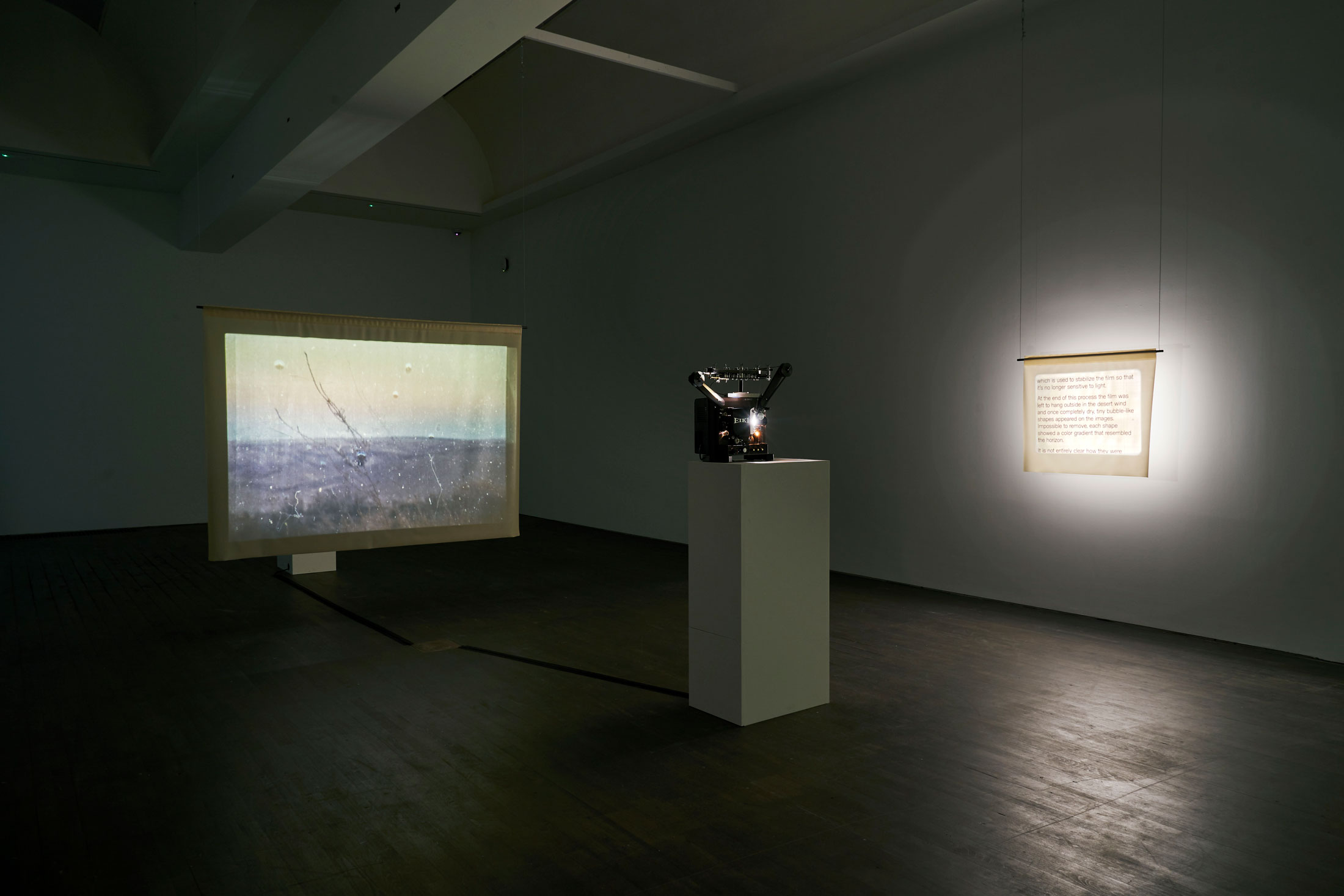
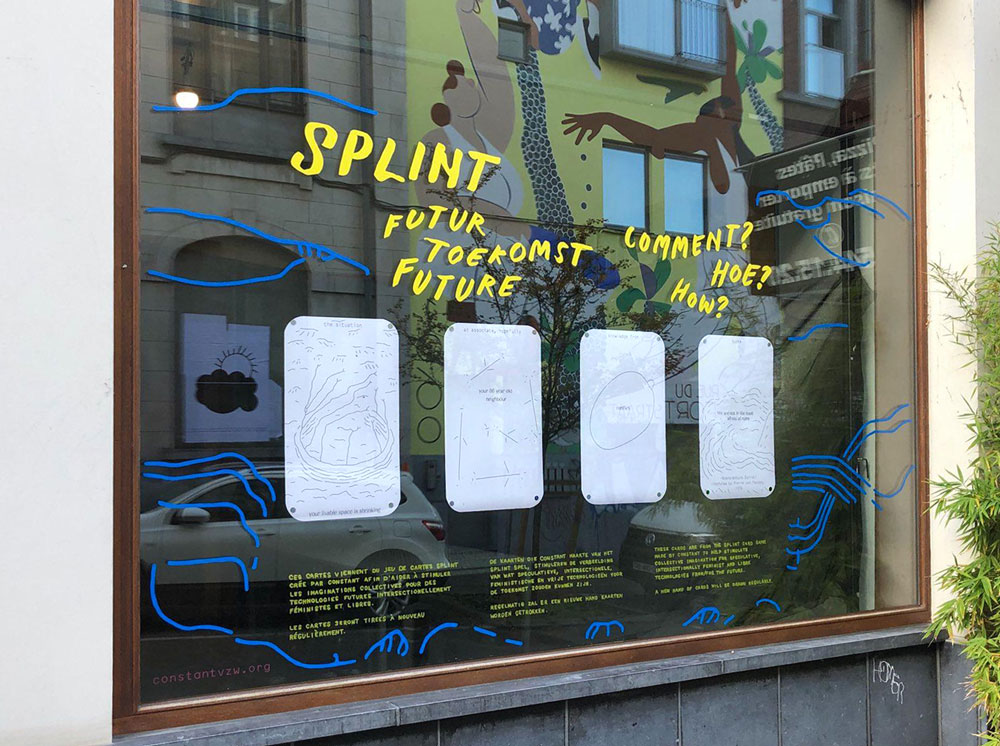
Exhibition
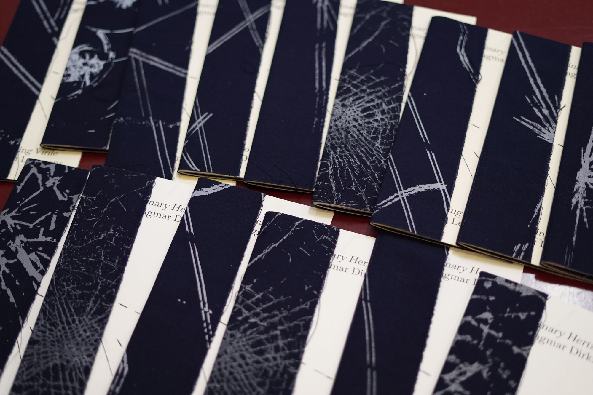
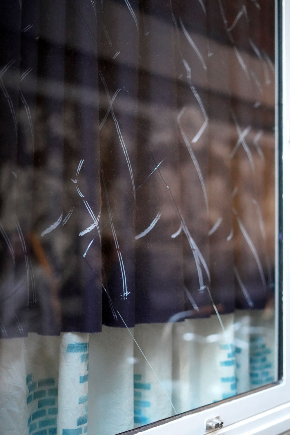
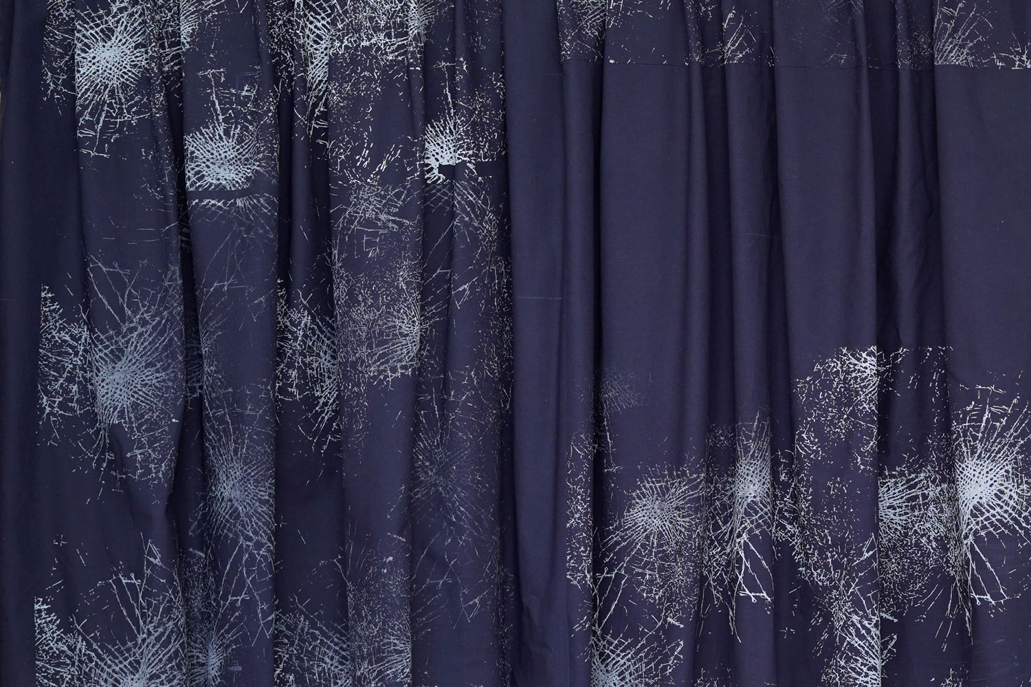
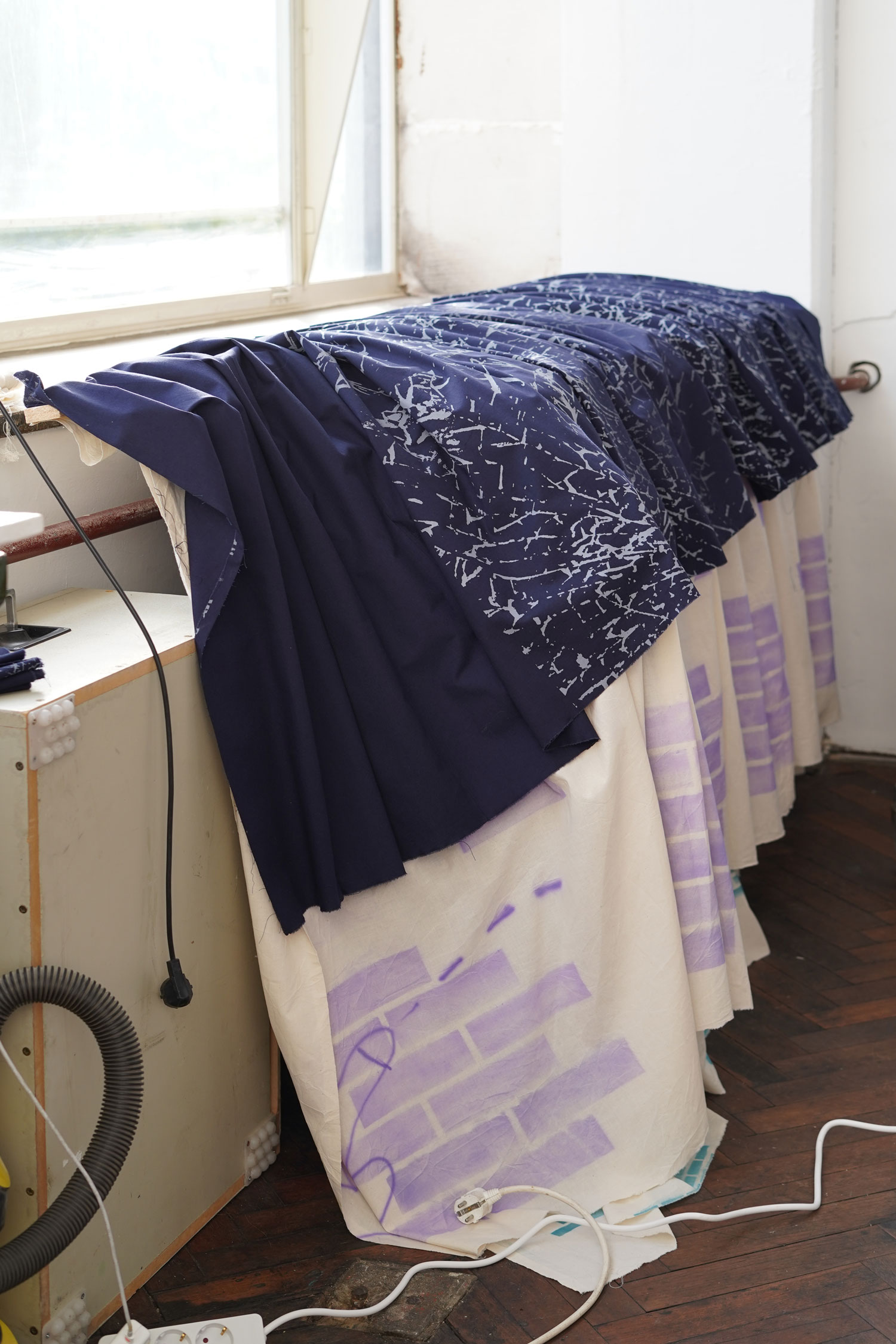
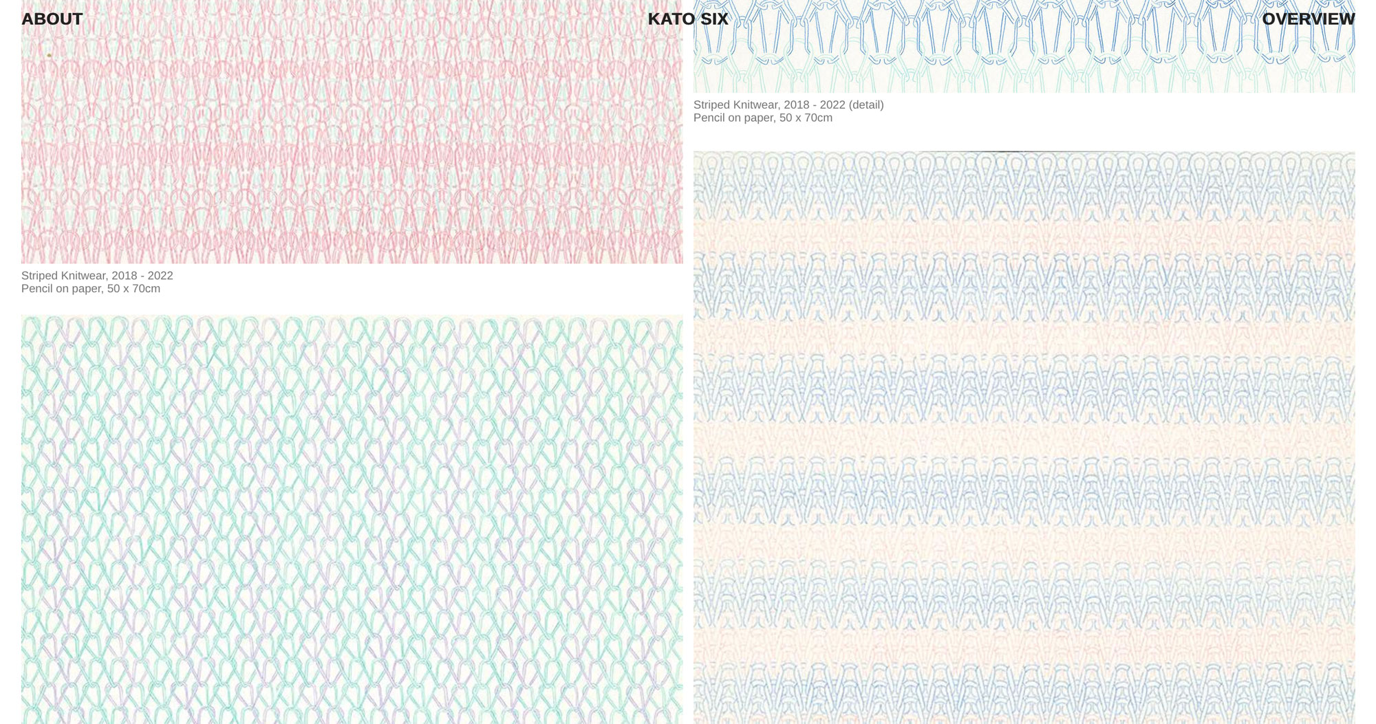
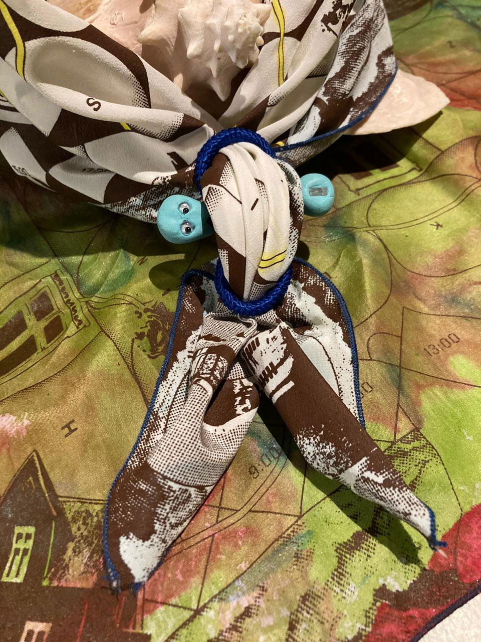
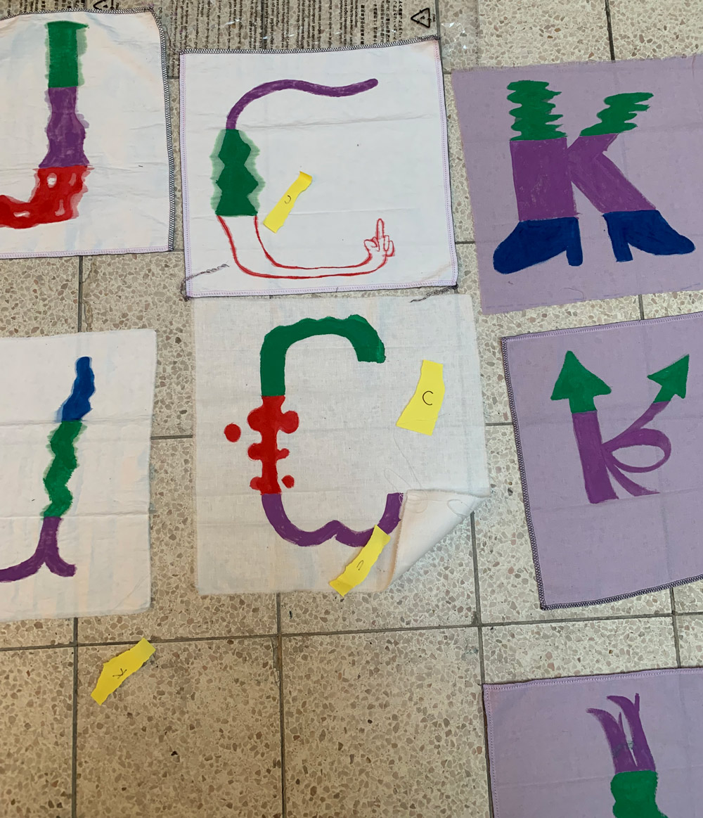
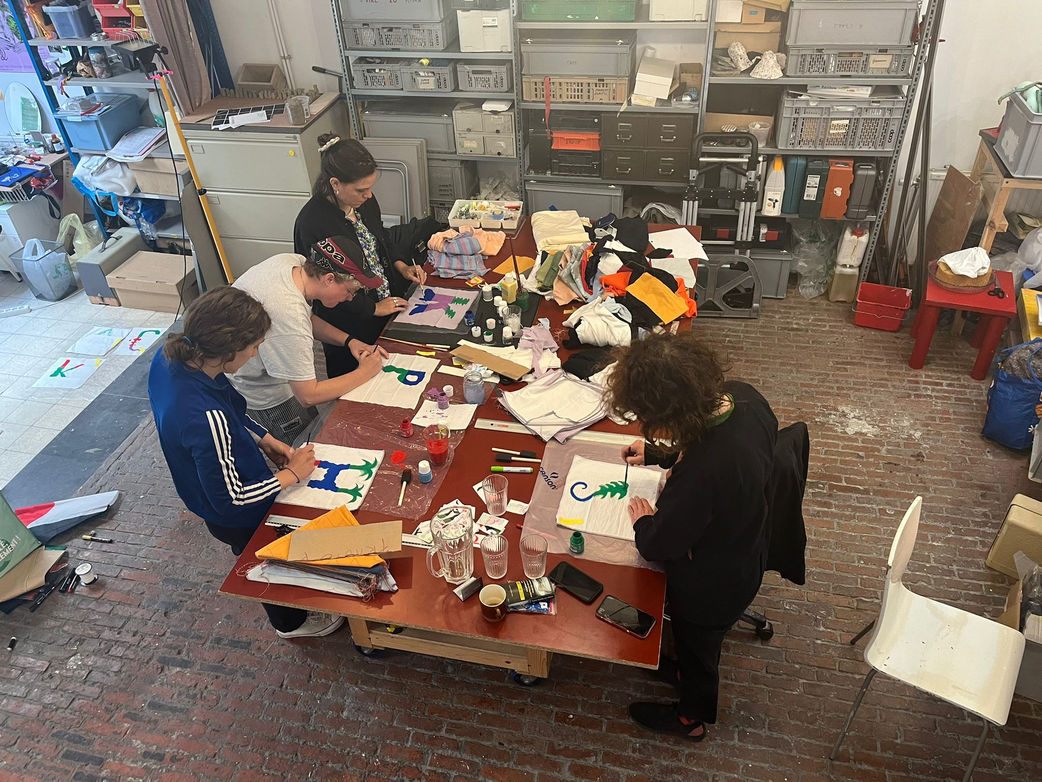
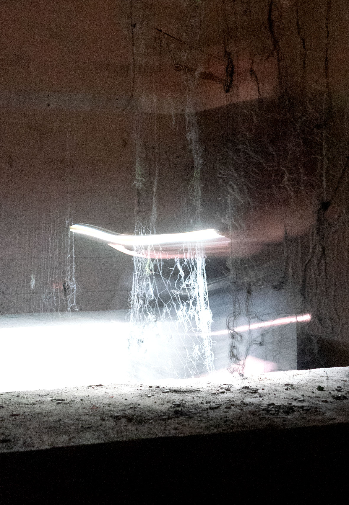
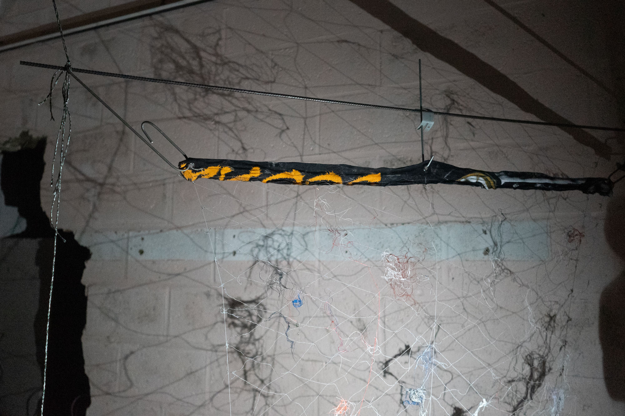
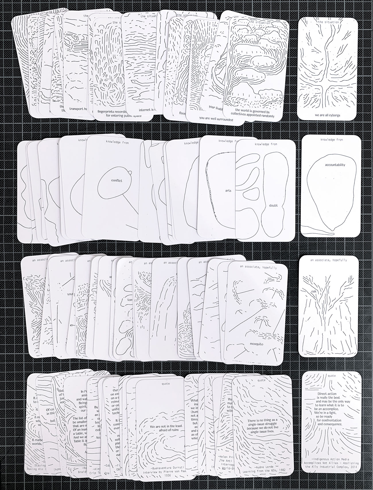
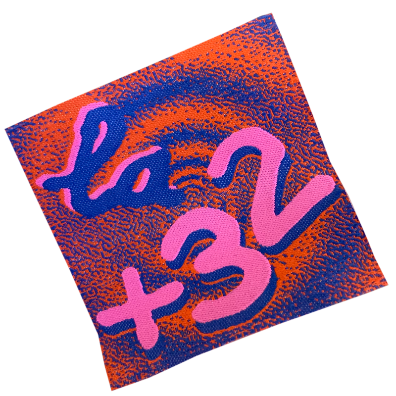
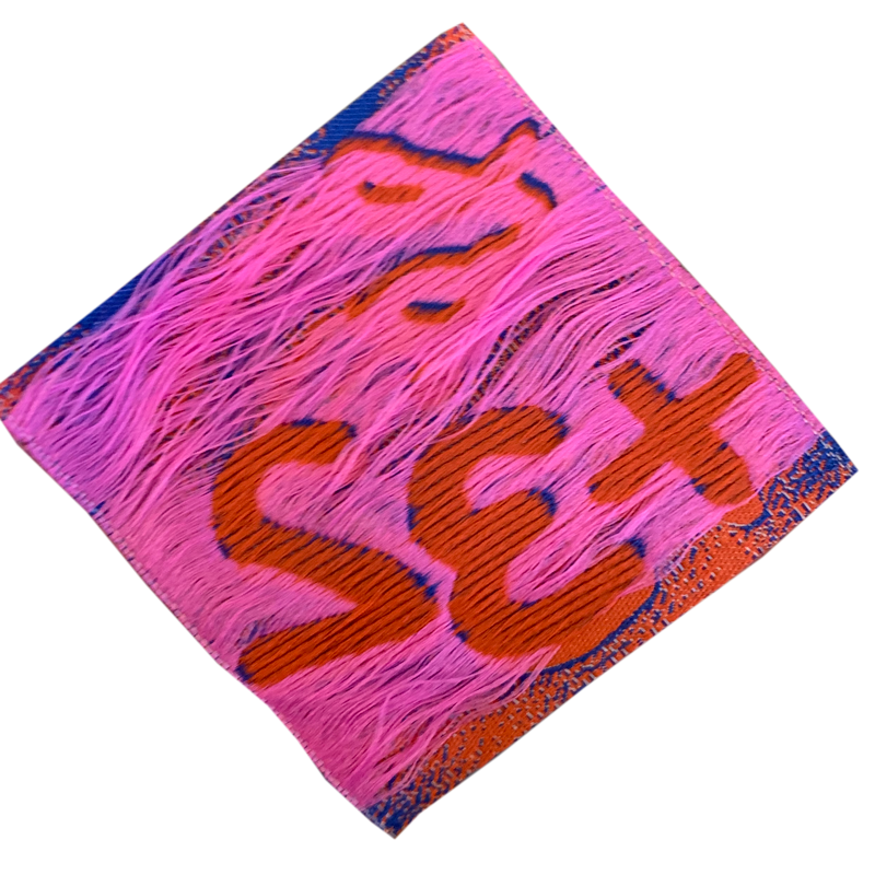
Samplers


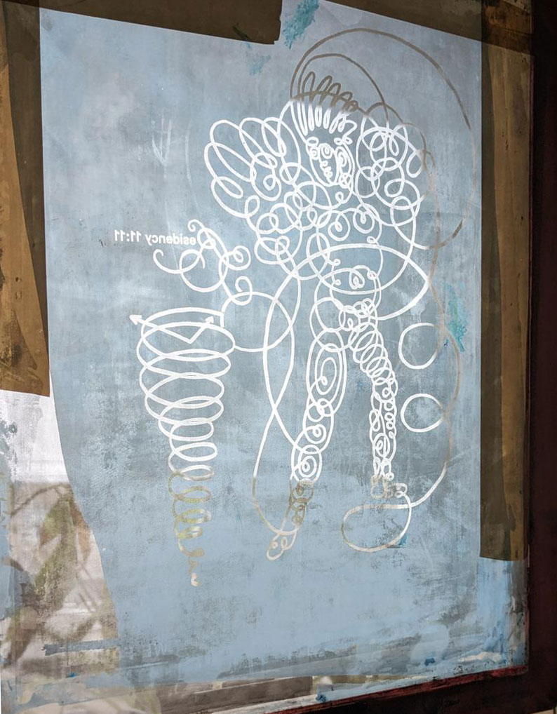
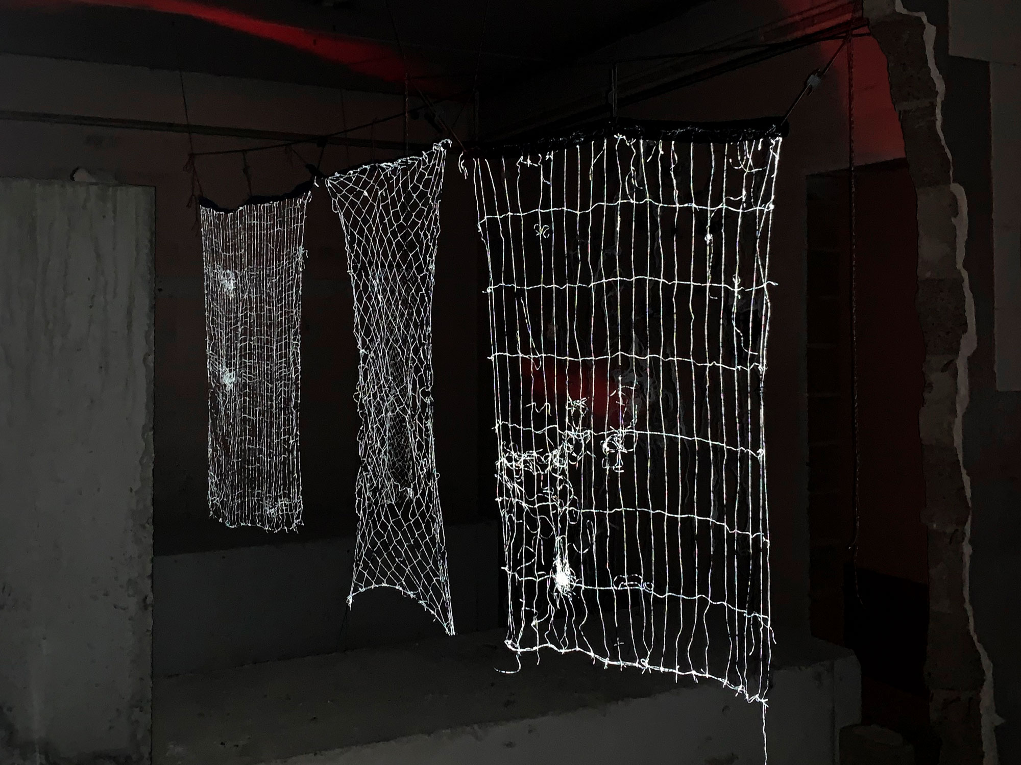
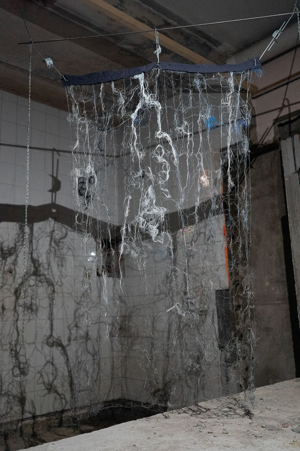
Samplers (Charlotte, Susanne and Sarah’s Atelier
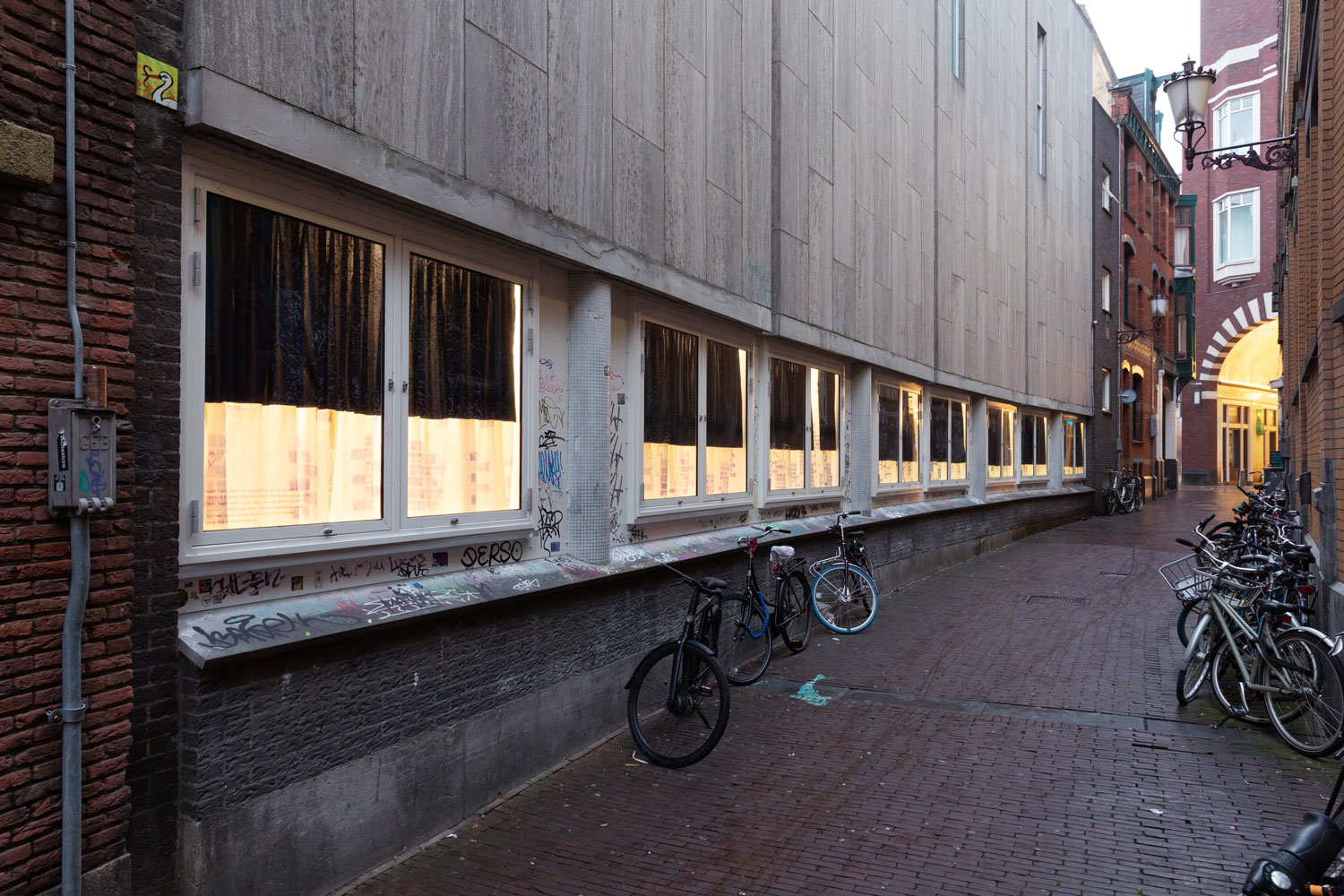
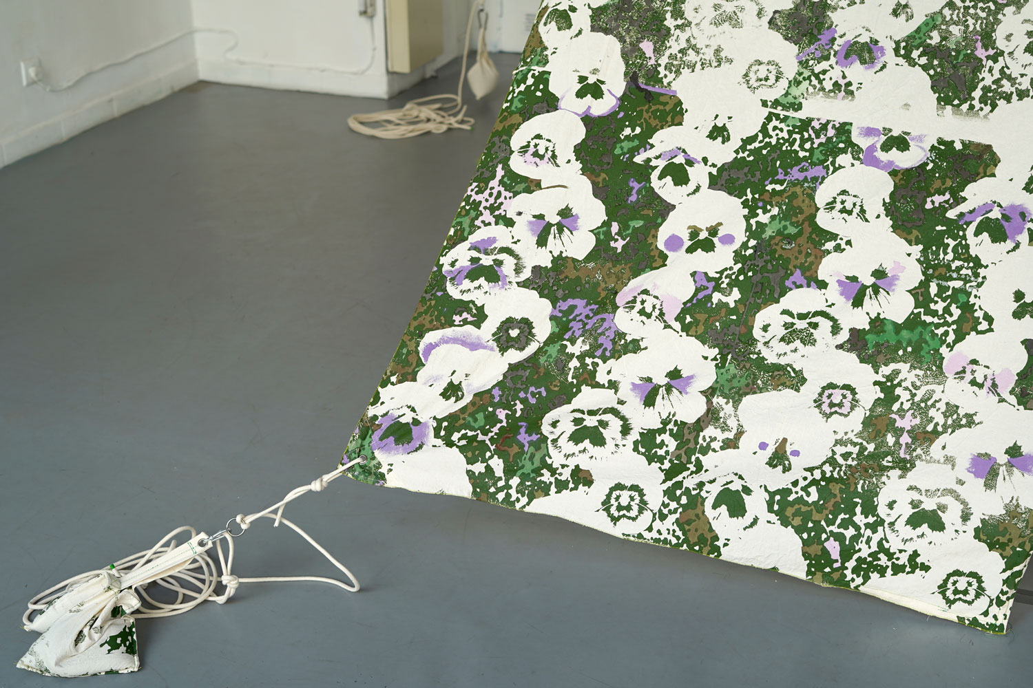
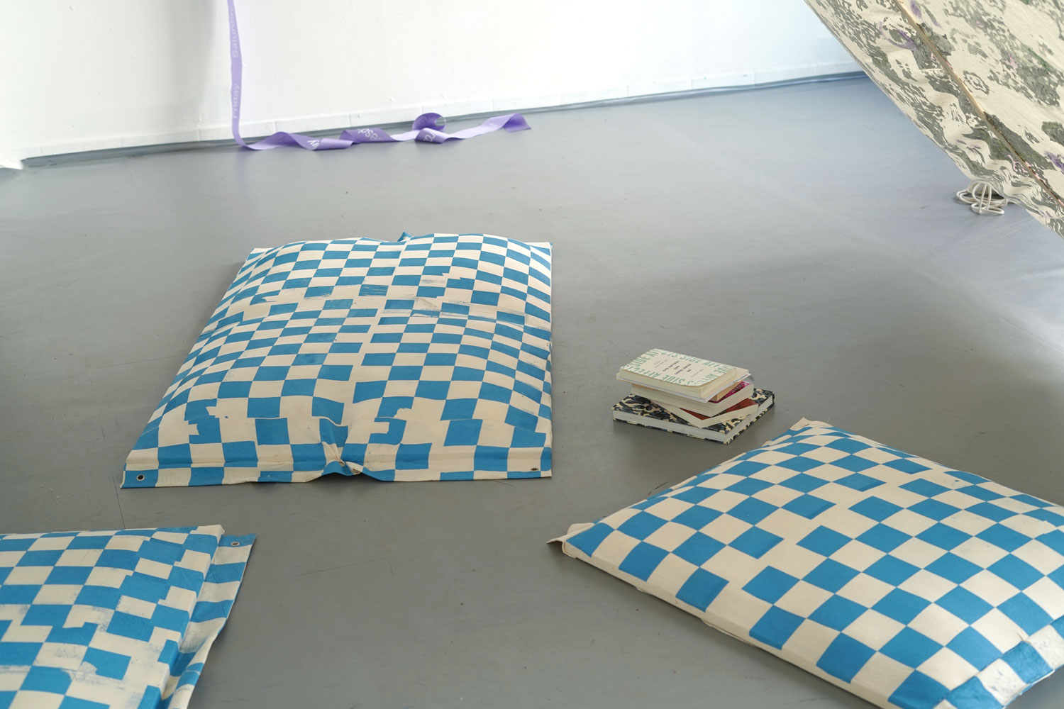
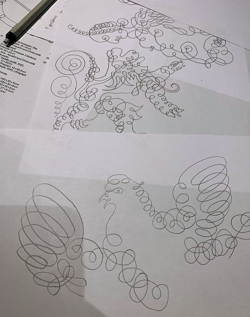
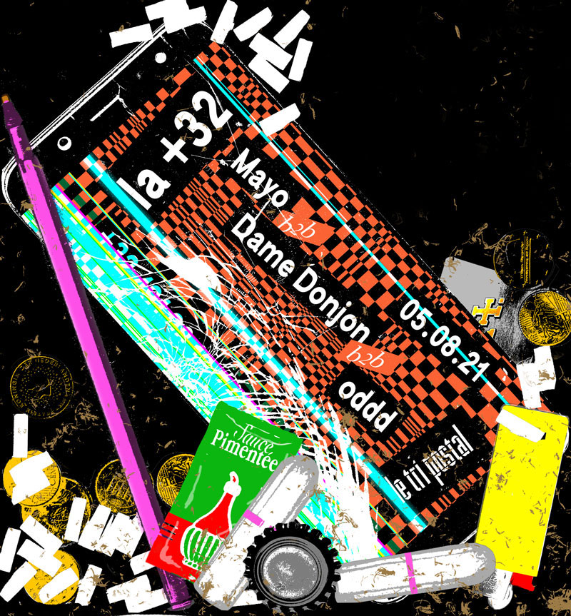
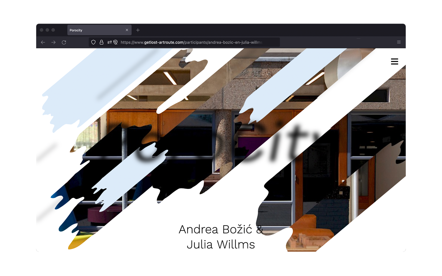
Inspiraling
CRAC Alsace 11.25 – 03.2026
Inspiraling, an exhibition by Katja Mater, Clare Noonan, Jessica Gysel, Marnie Slater, Robin Brettar and Matilda Çobanli, with MYCKET, Ot Lemmens, Sophy Naess, Judith Geerts, Nienke Fransen, Christine de Pizan, Rosalind Nashashibi and Anne Reijniers & Eline De Clercq.
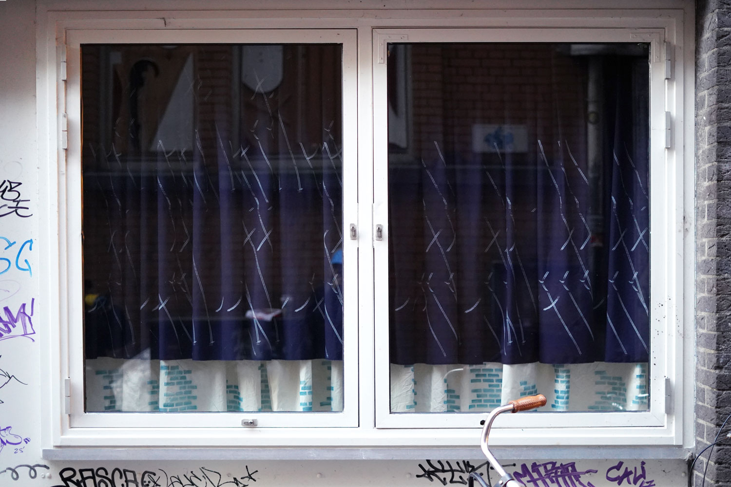
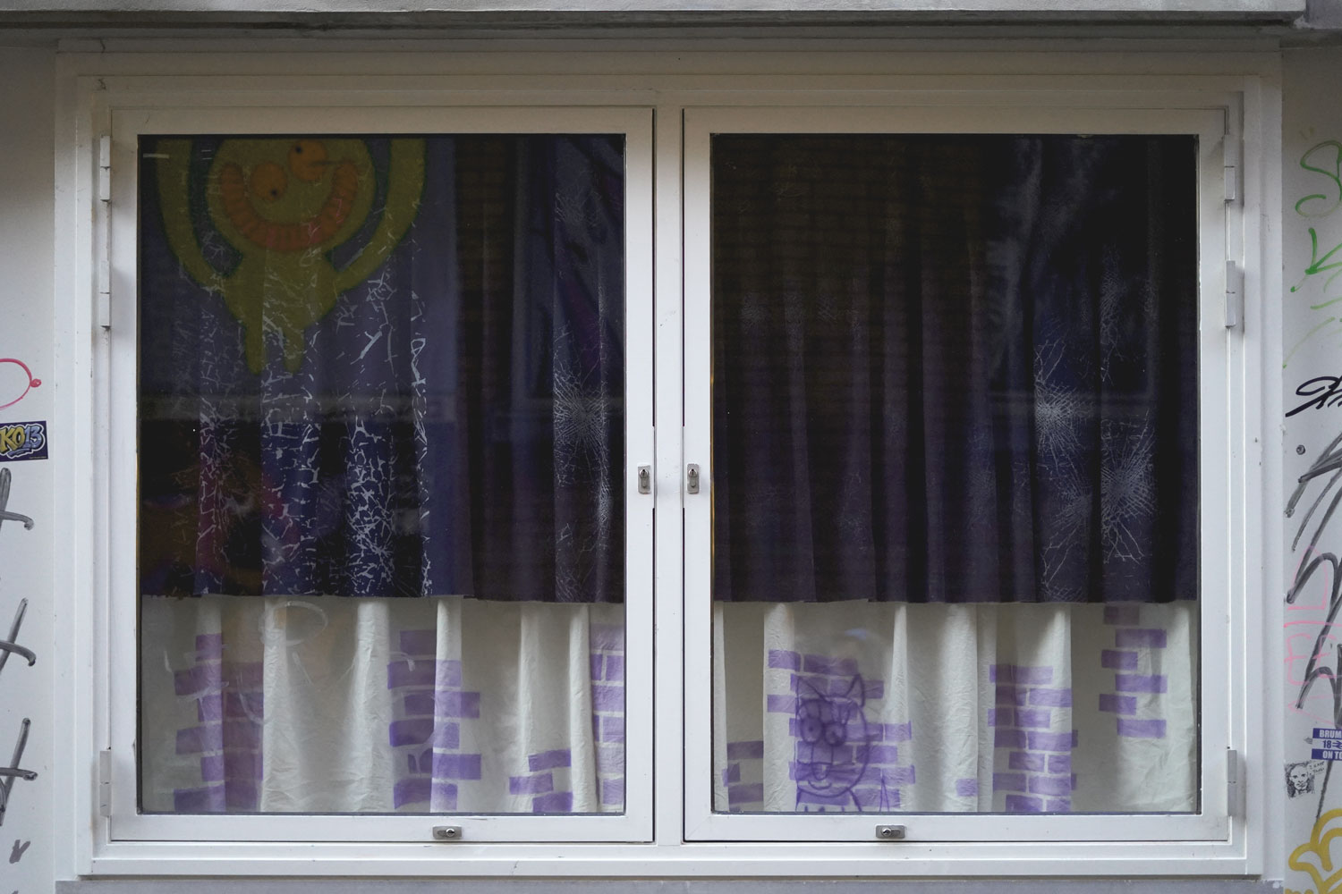
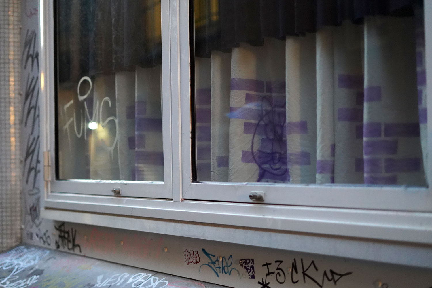
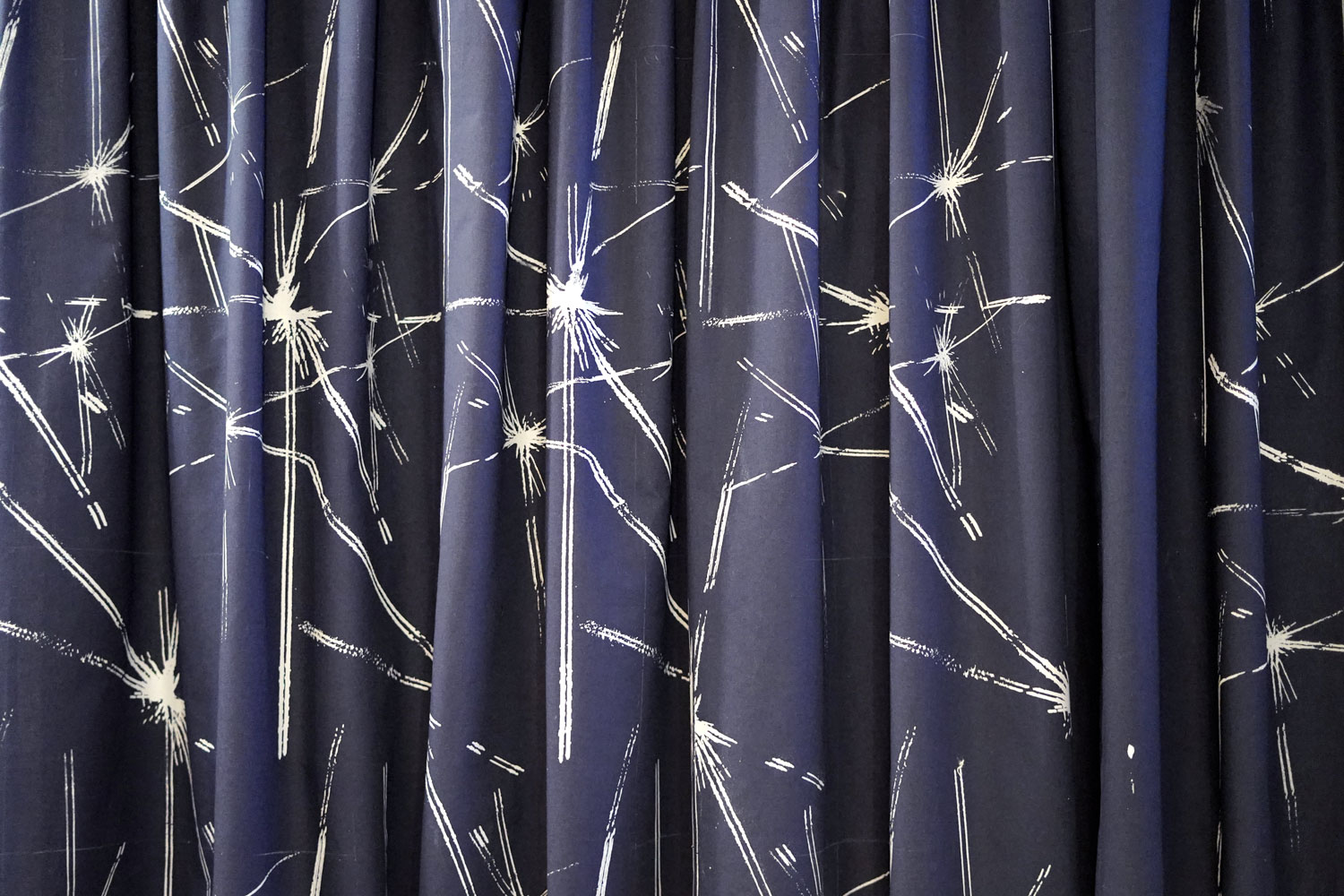
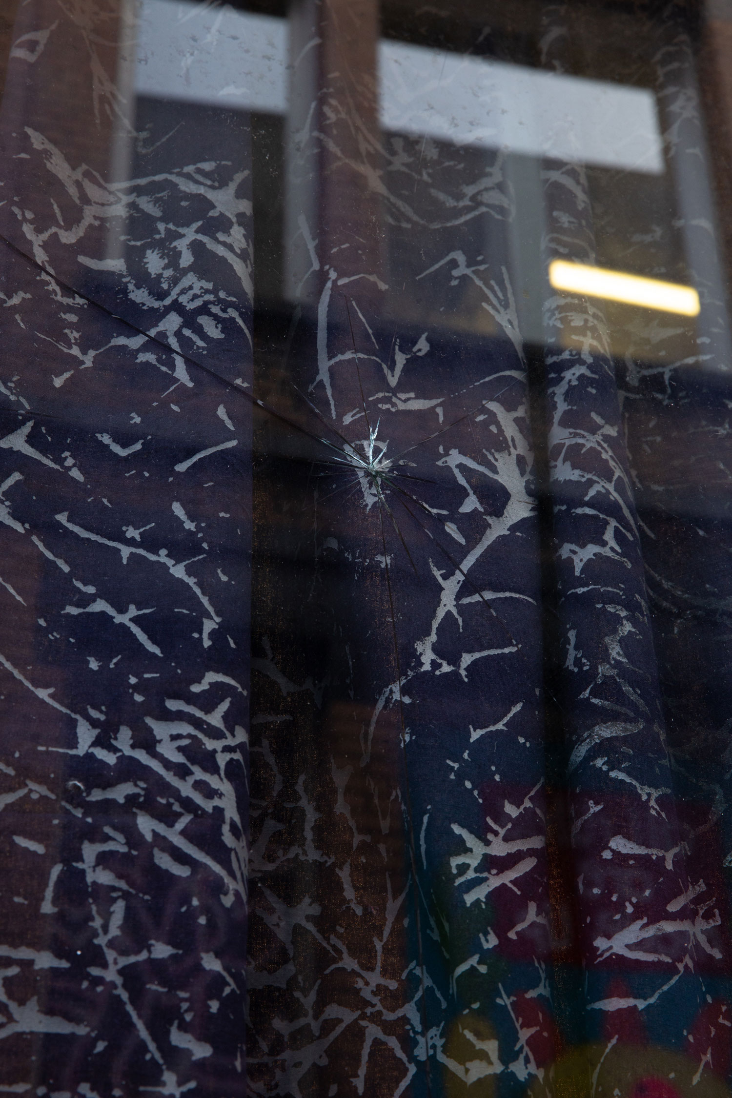
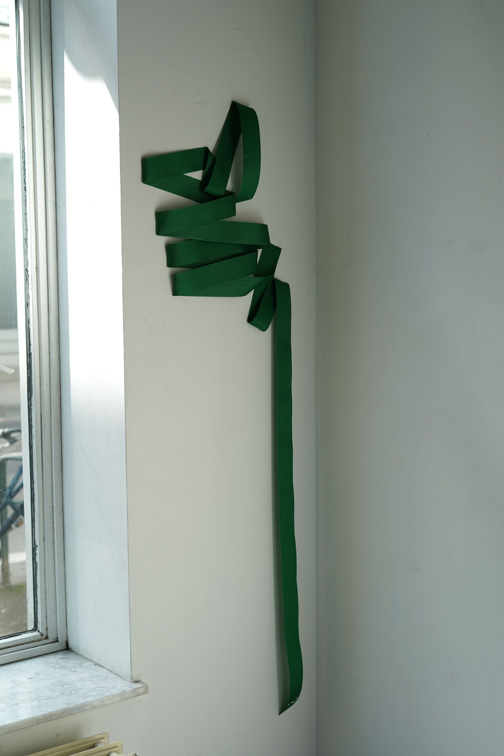
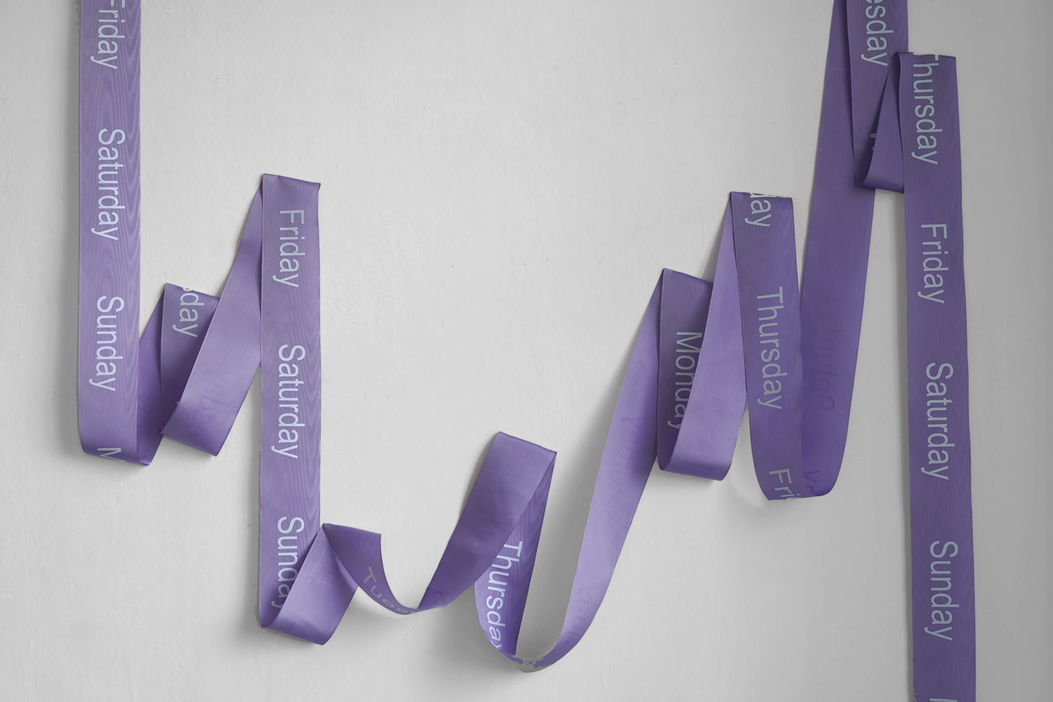
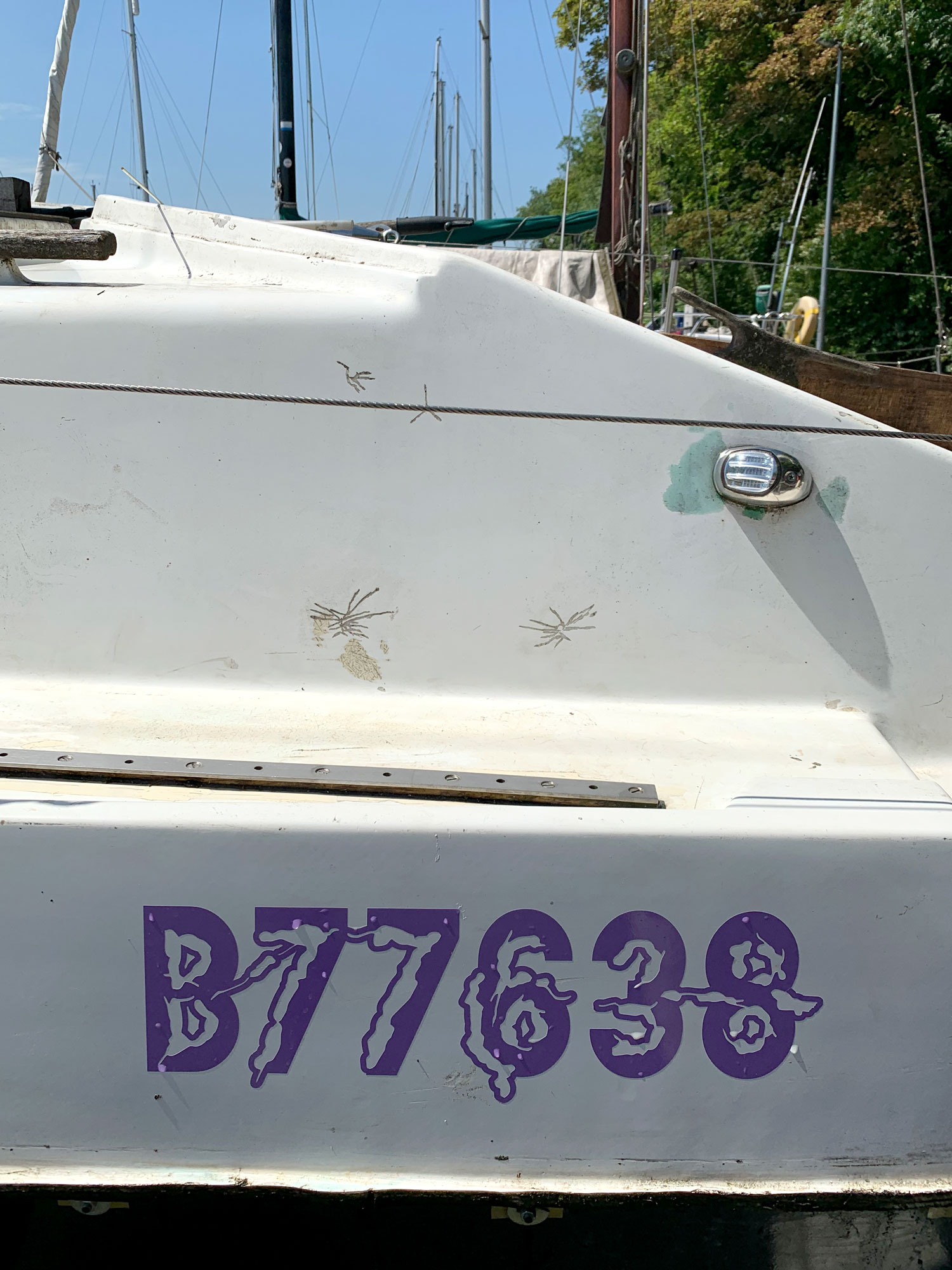
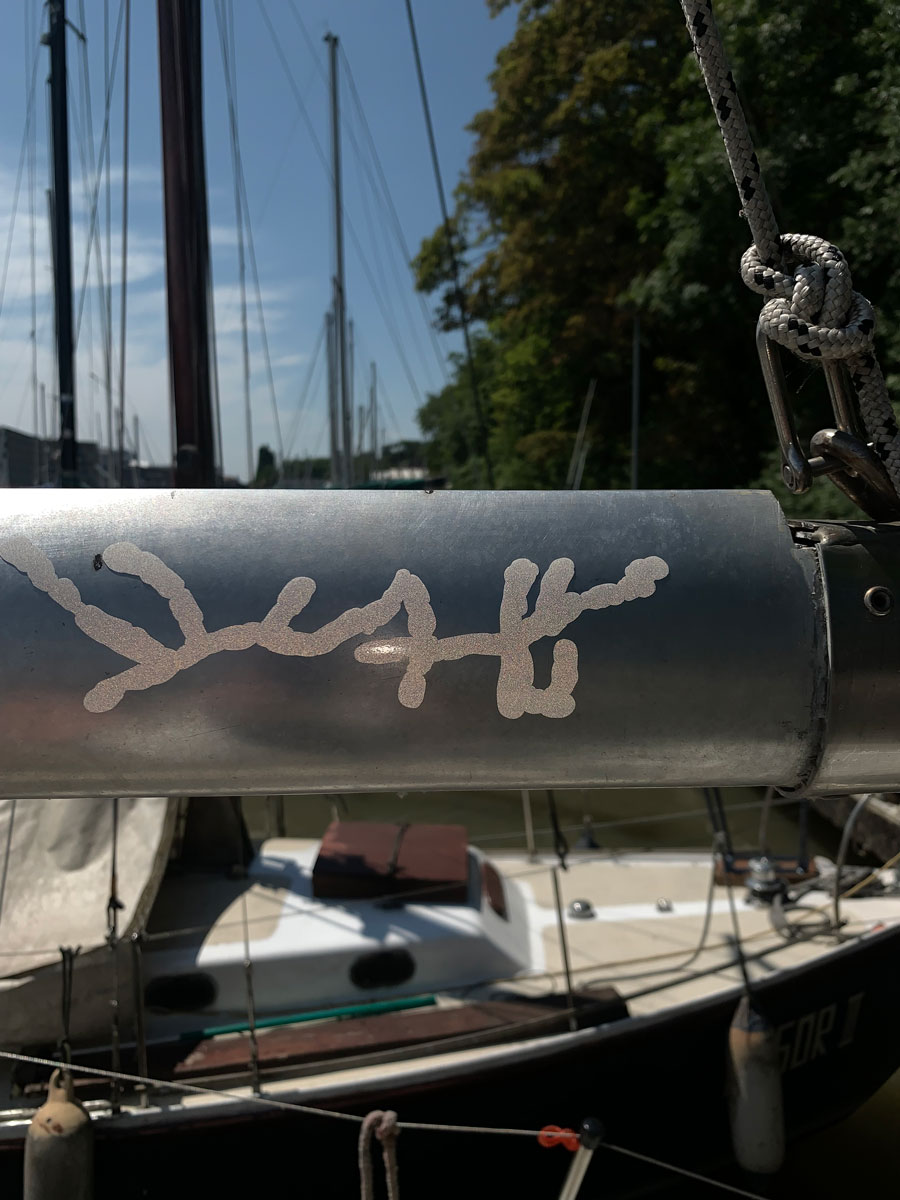
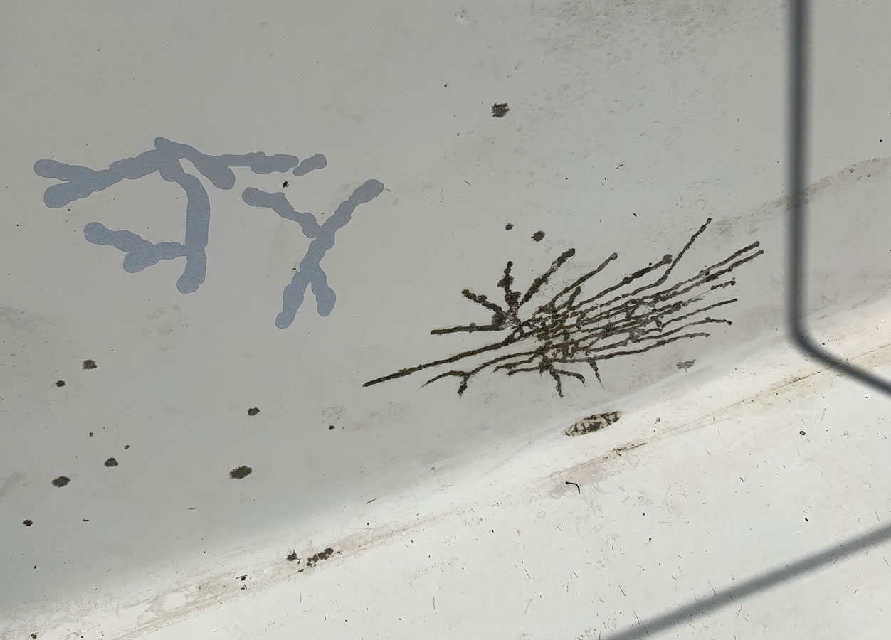
10 samplers
polyester and cotton thread – ~15 x 30cm each
Pictures by A. Mole.
Documentation of the entire show is to be found here (and really worth a scroll):
www.cracalsace.com/inspiralling
Thank you CRAC Alsace team, Victor and Robin, Matilda, Katja, Jessica, Marnie and Clare for inviting me to this beautiful show.
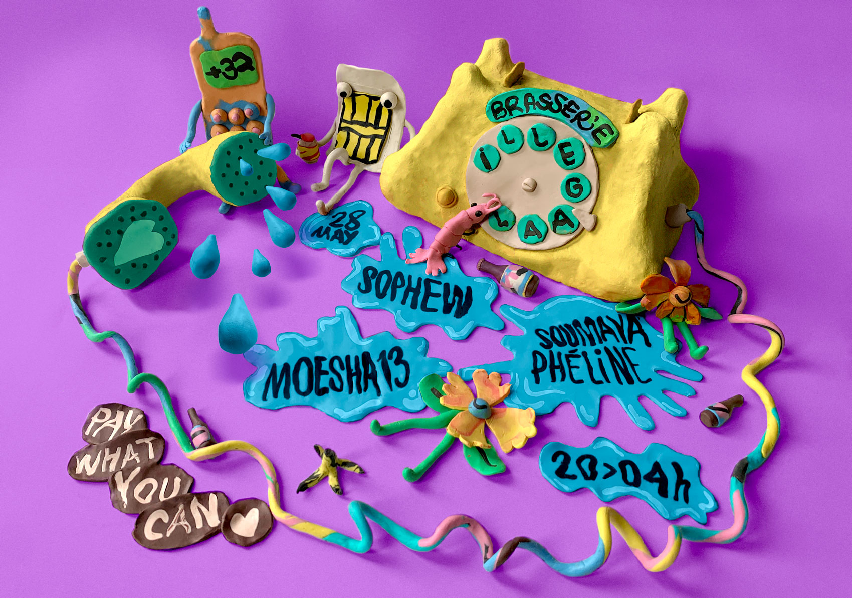
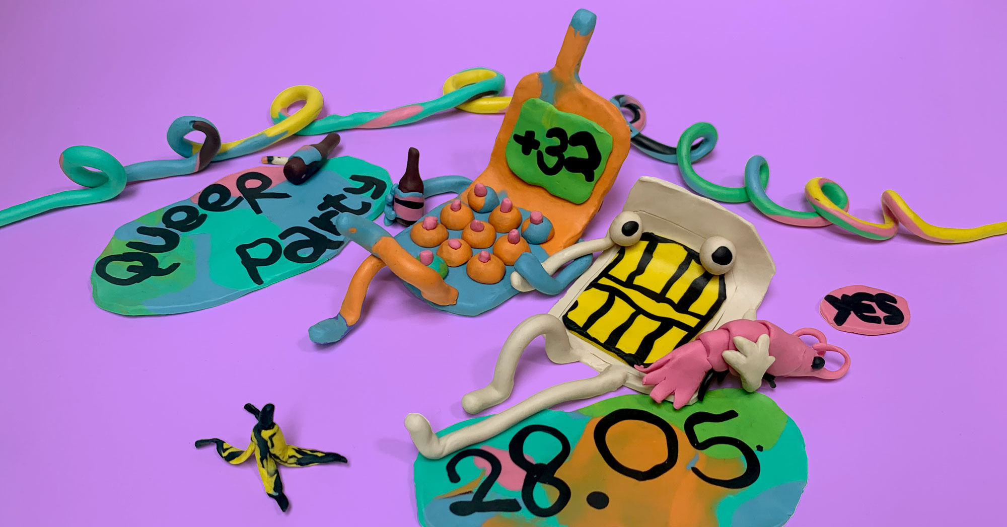
In this groupshow about collectivity and friendship, i was invited to show 10 of these works that I have been making from threadcuttings of my friends’ atelier, in which the colorful sequence of their projects makes up a new fabric.