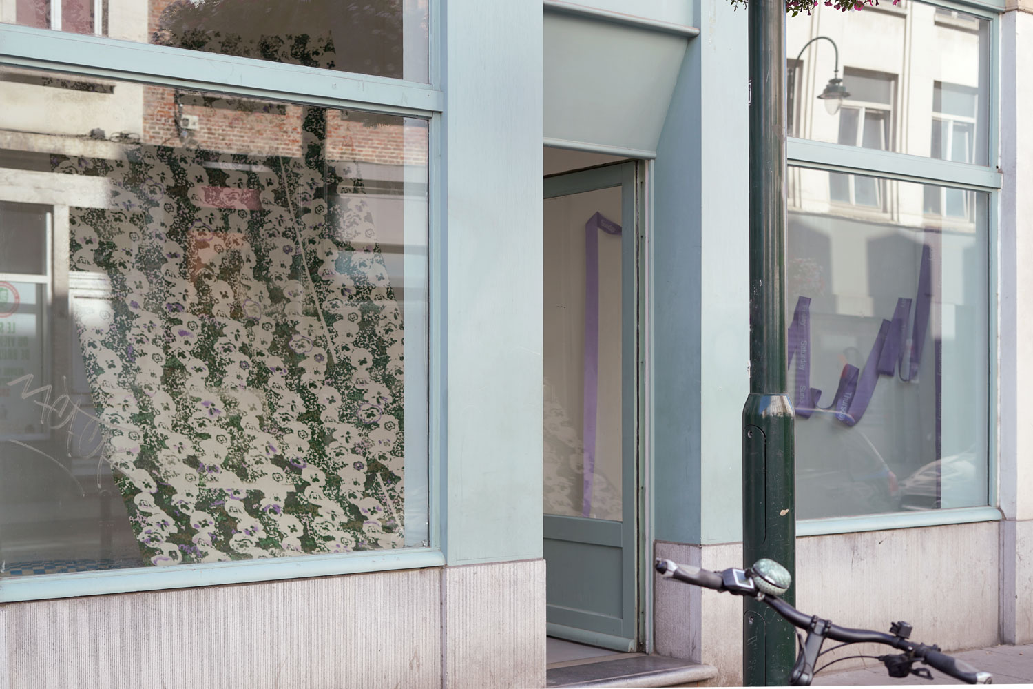
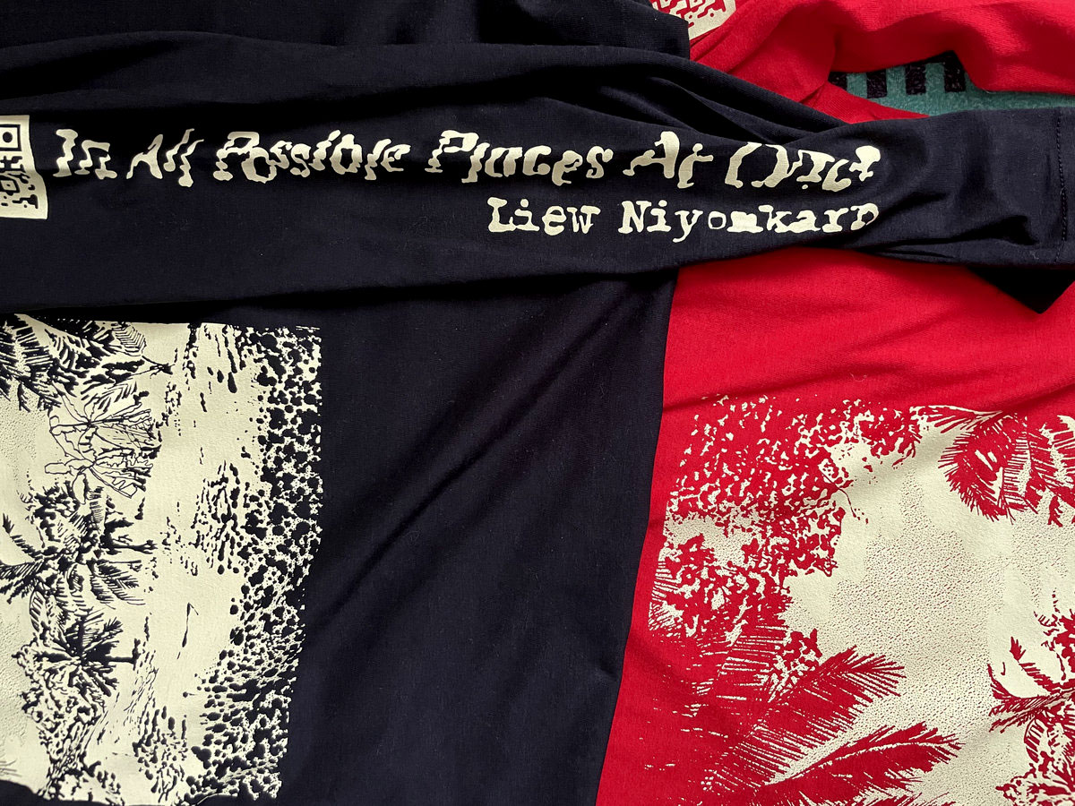
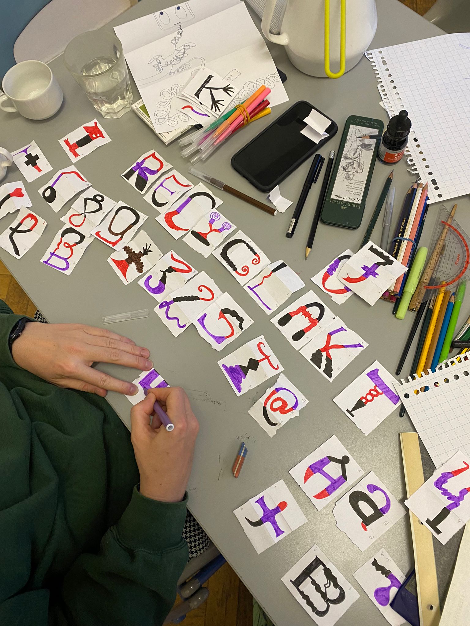
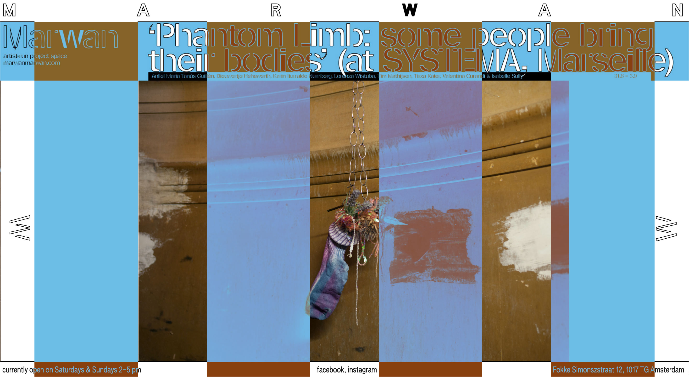
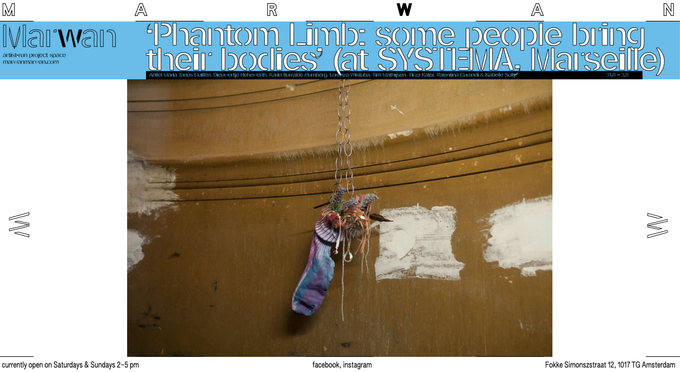
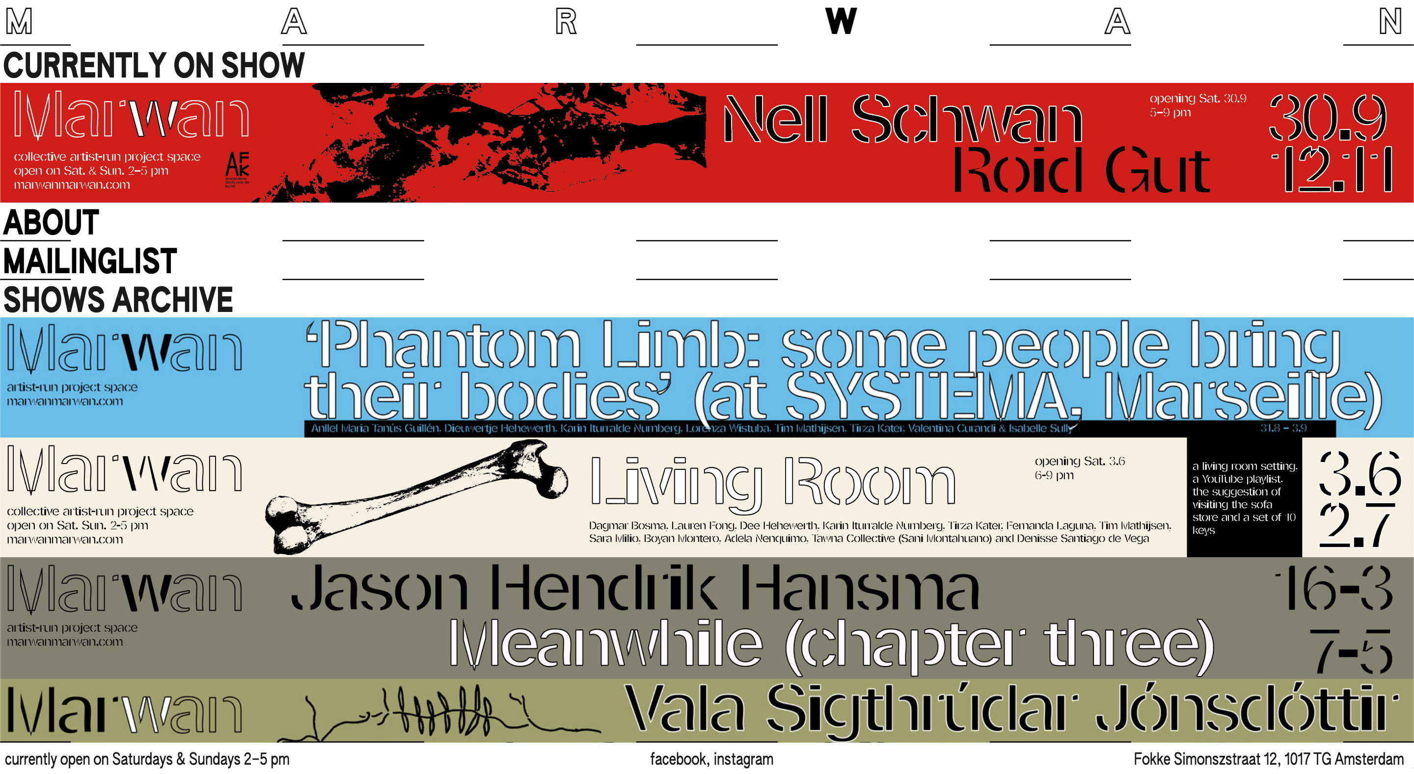
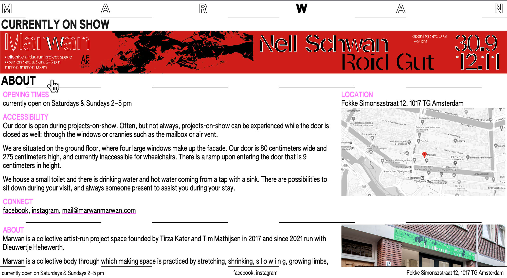
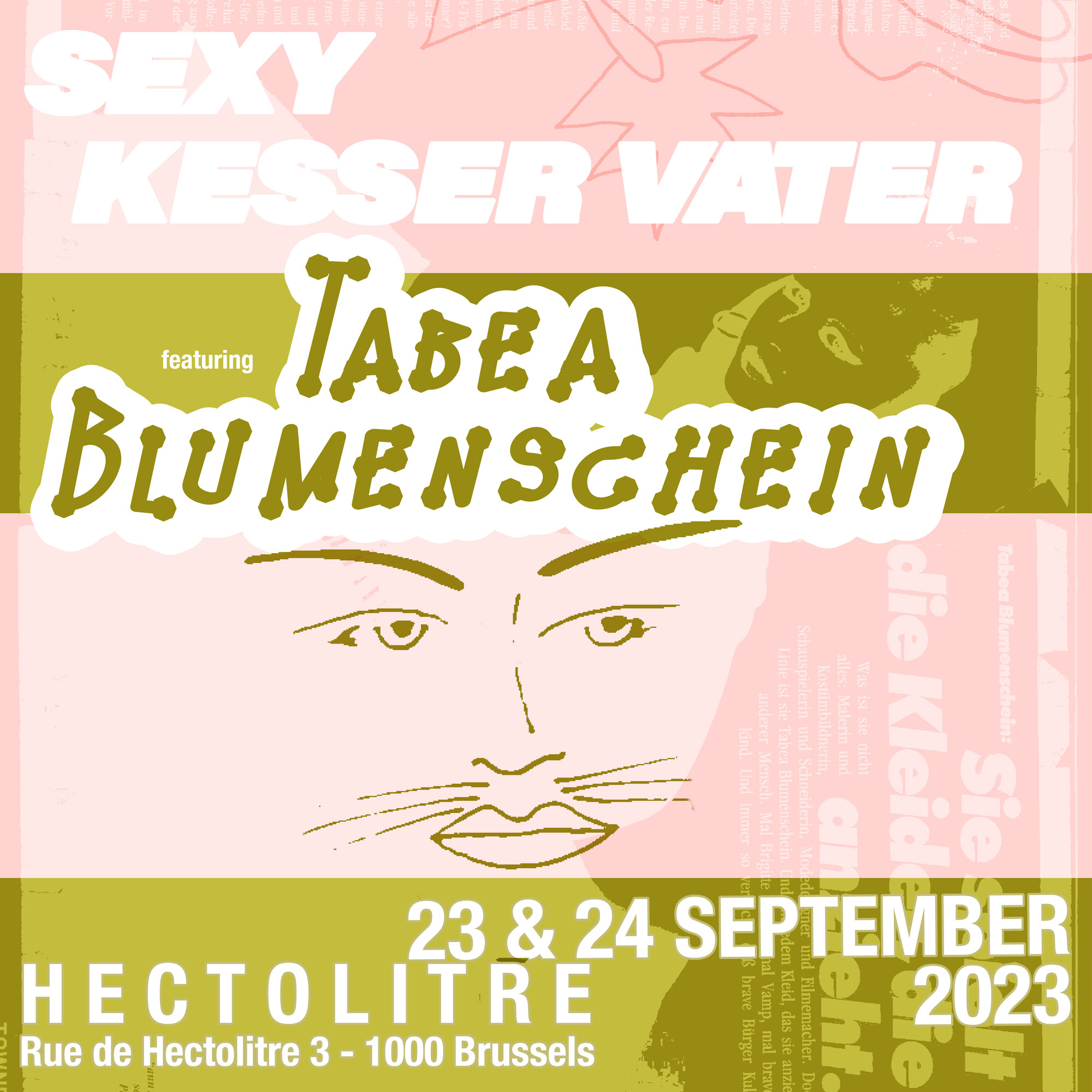
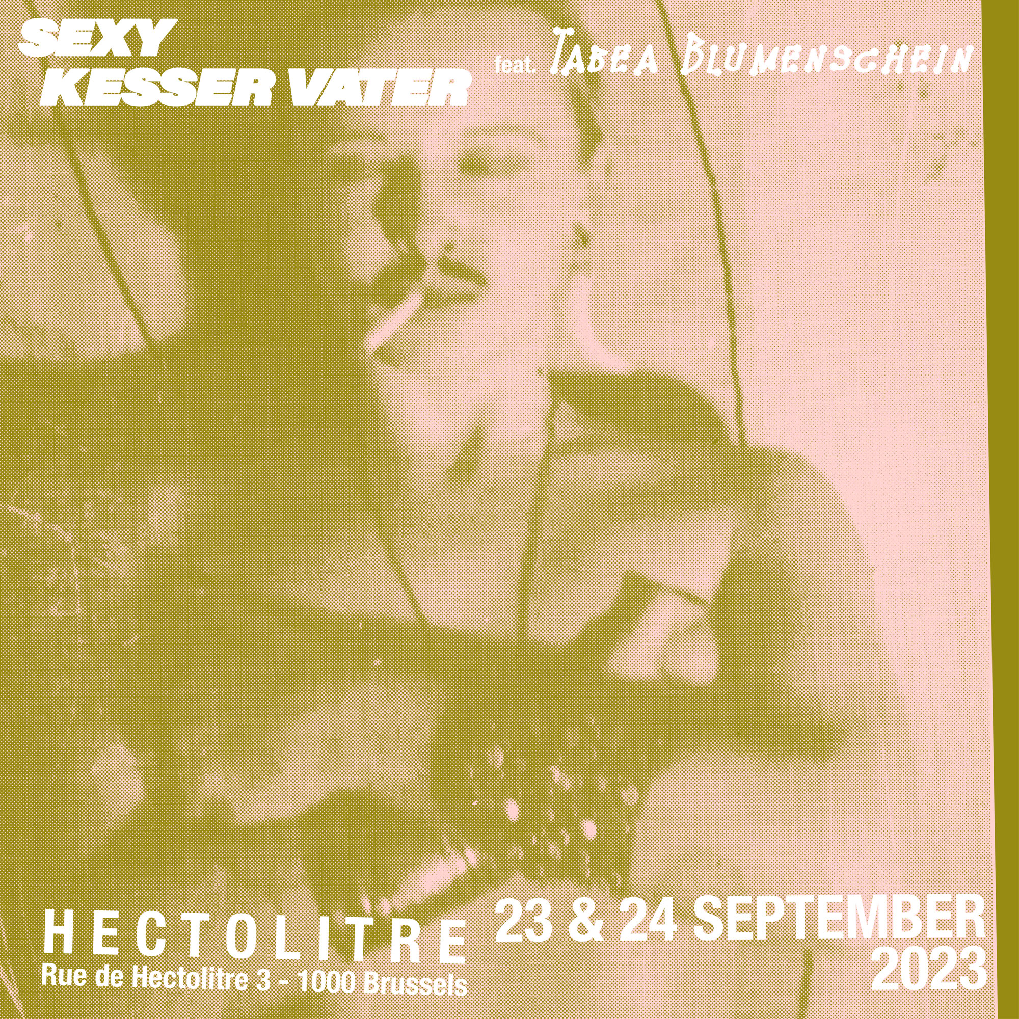
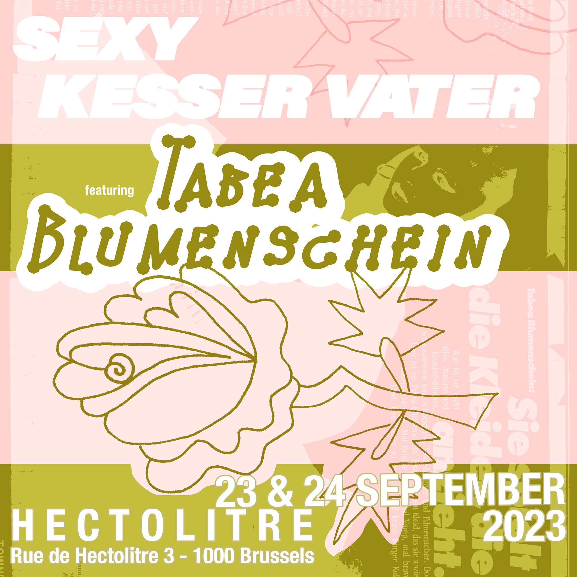
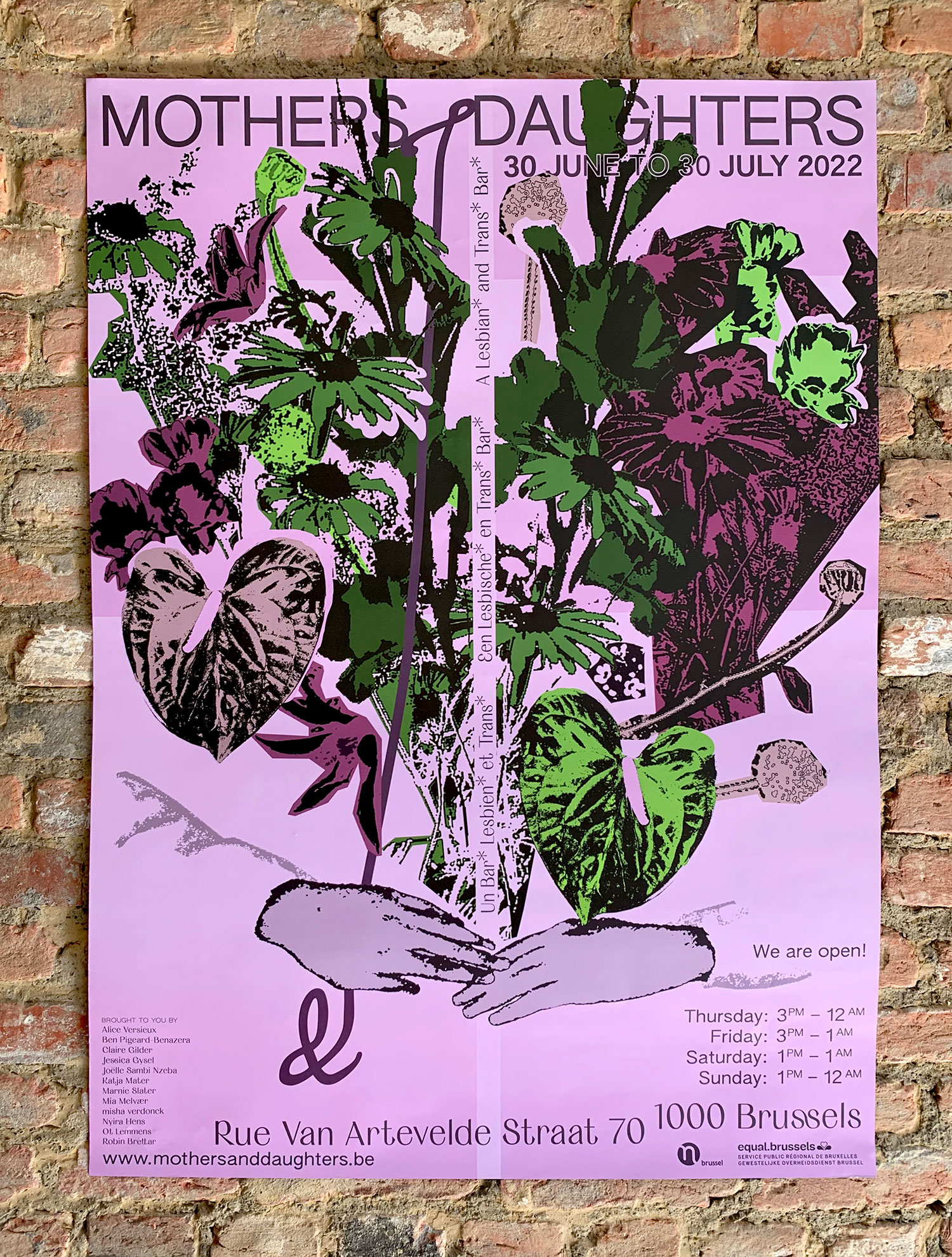
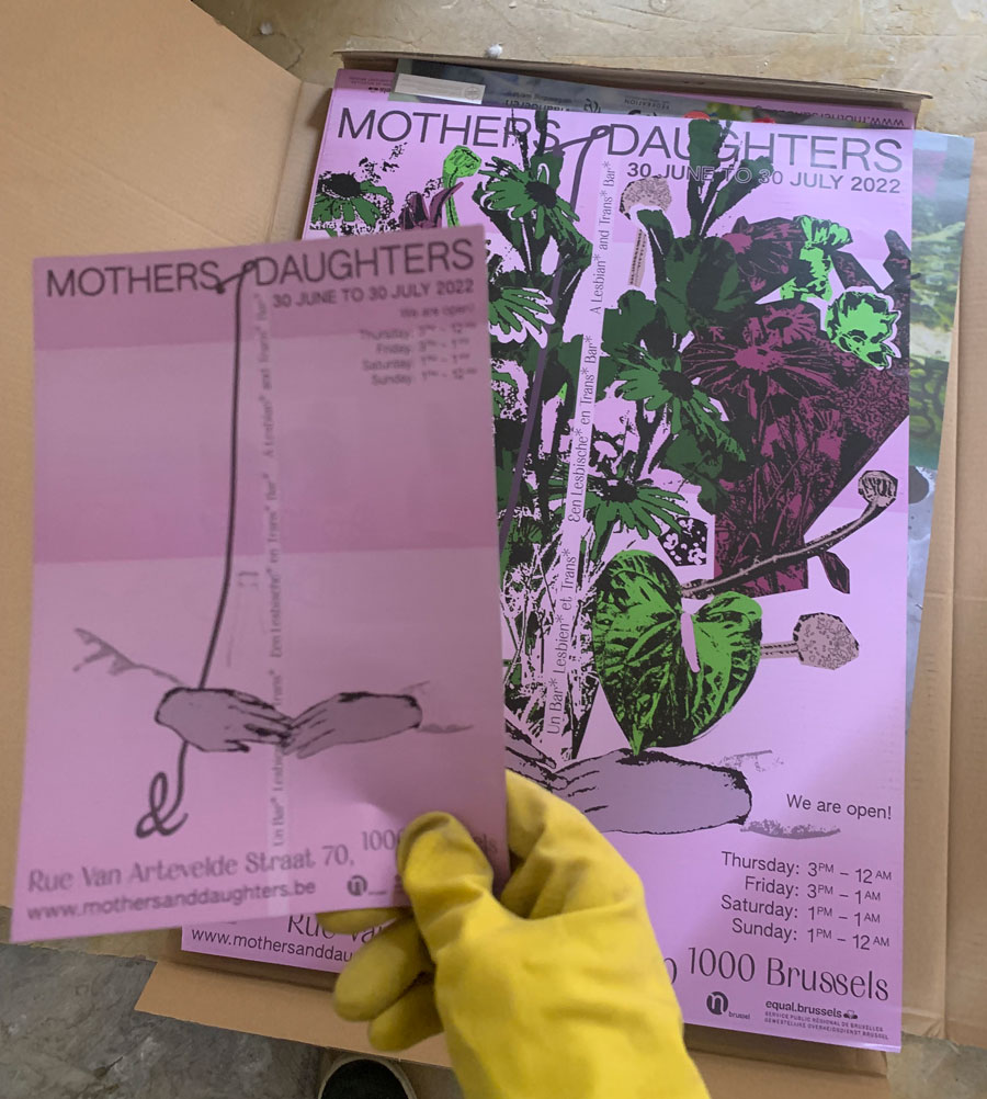
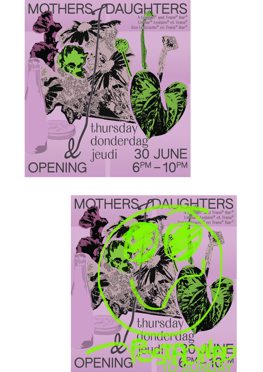
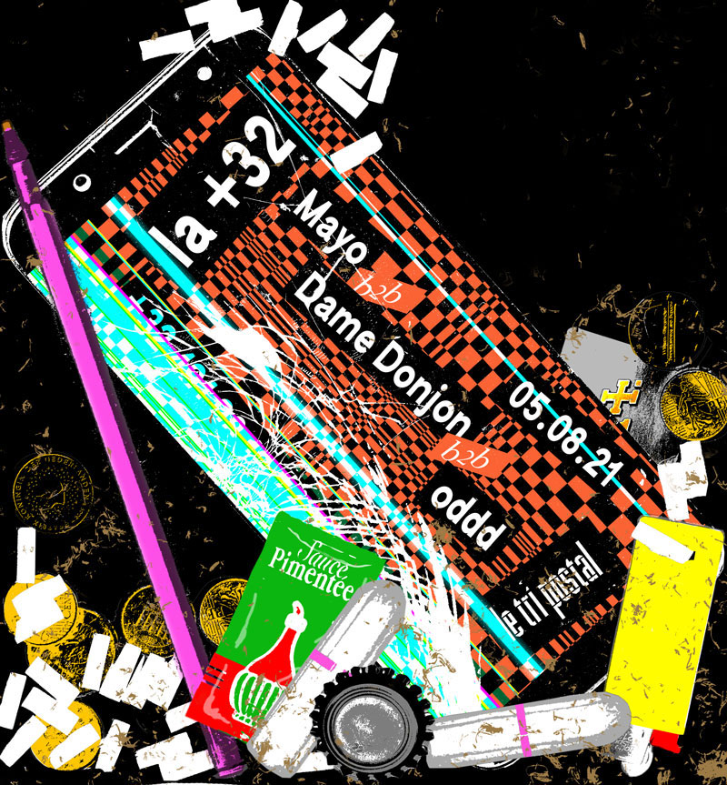
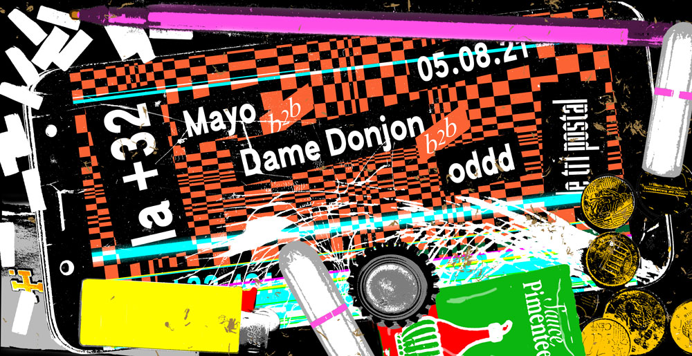
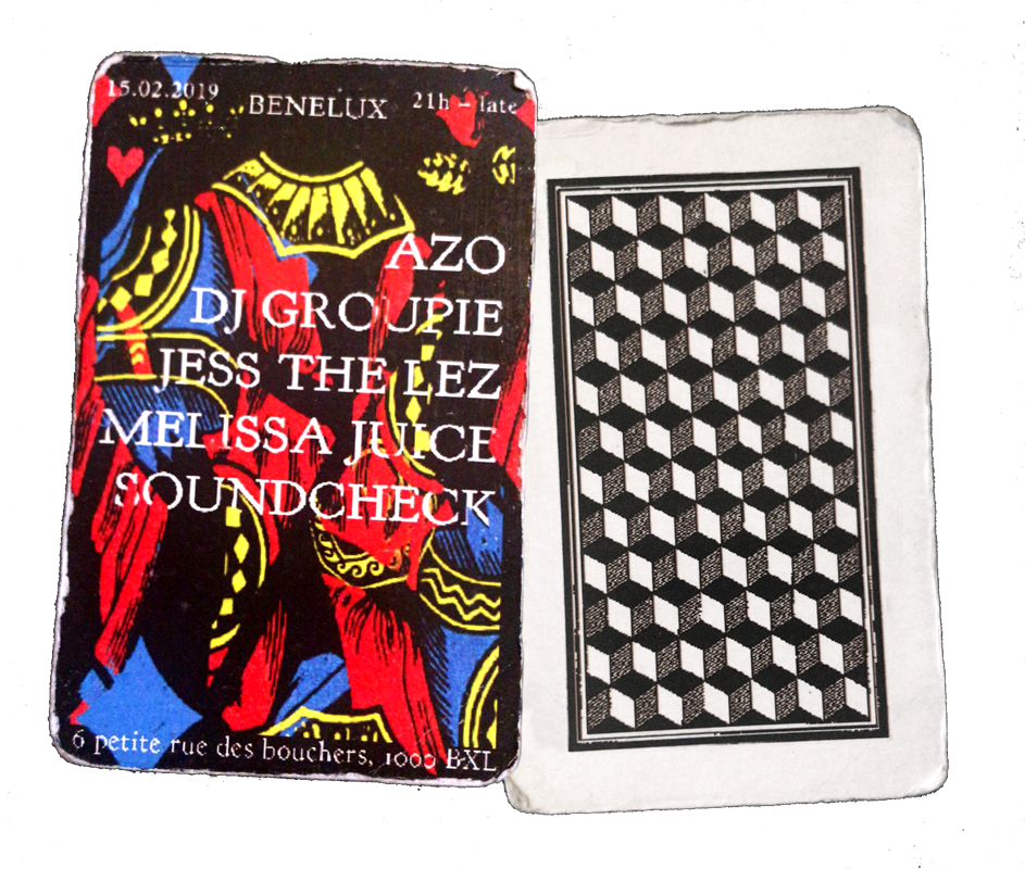
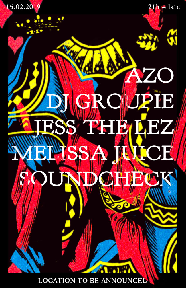
Poster
Mothers & Daughters
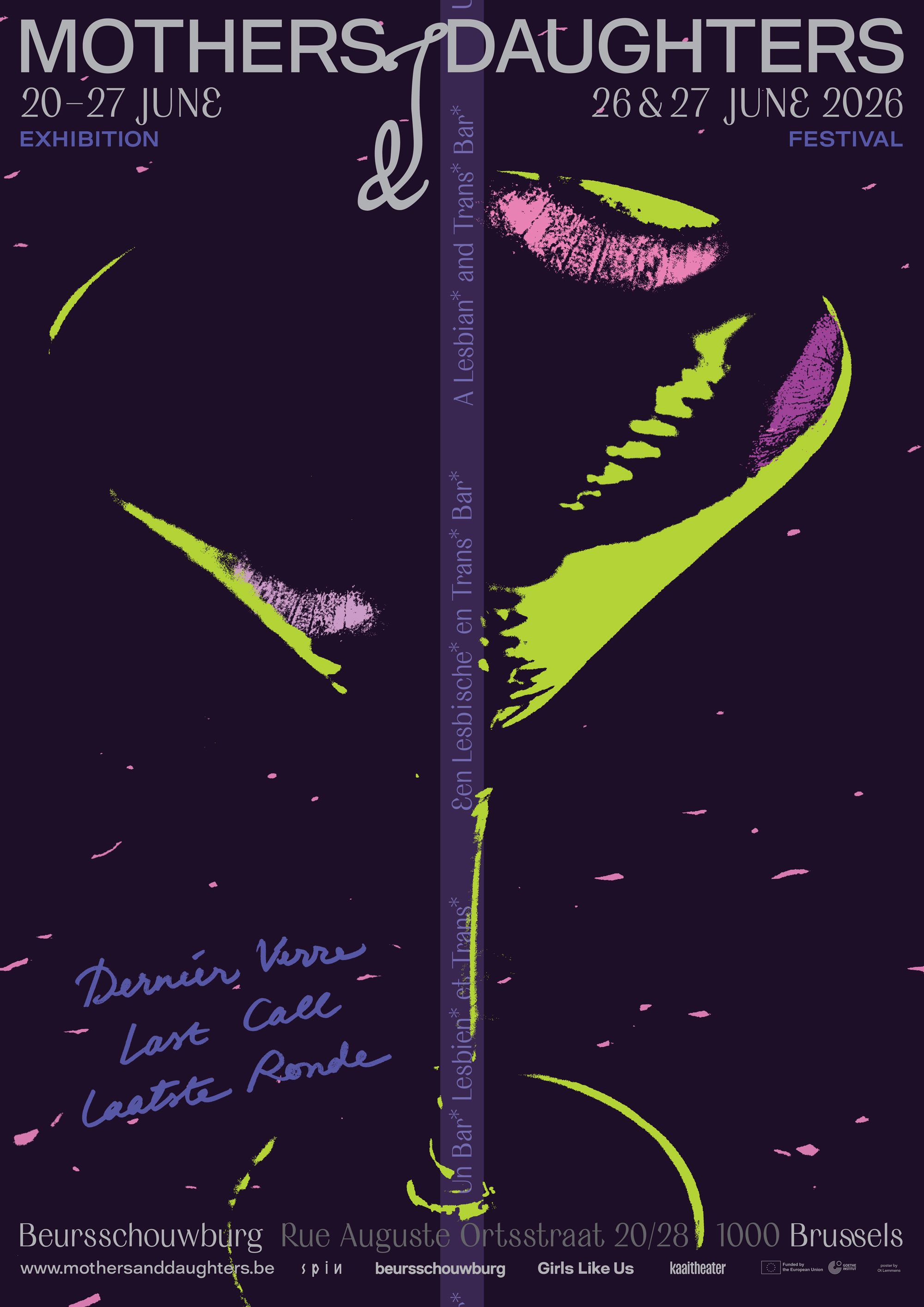

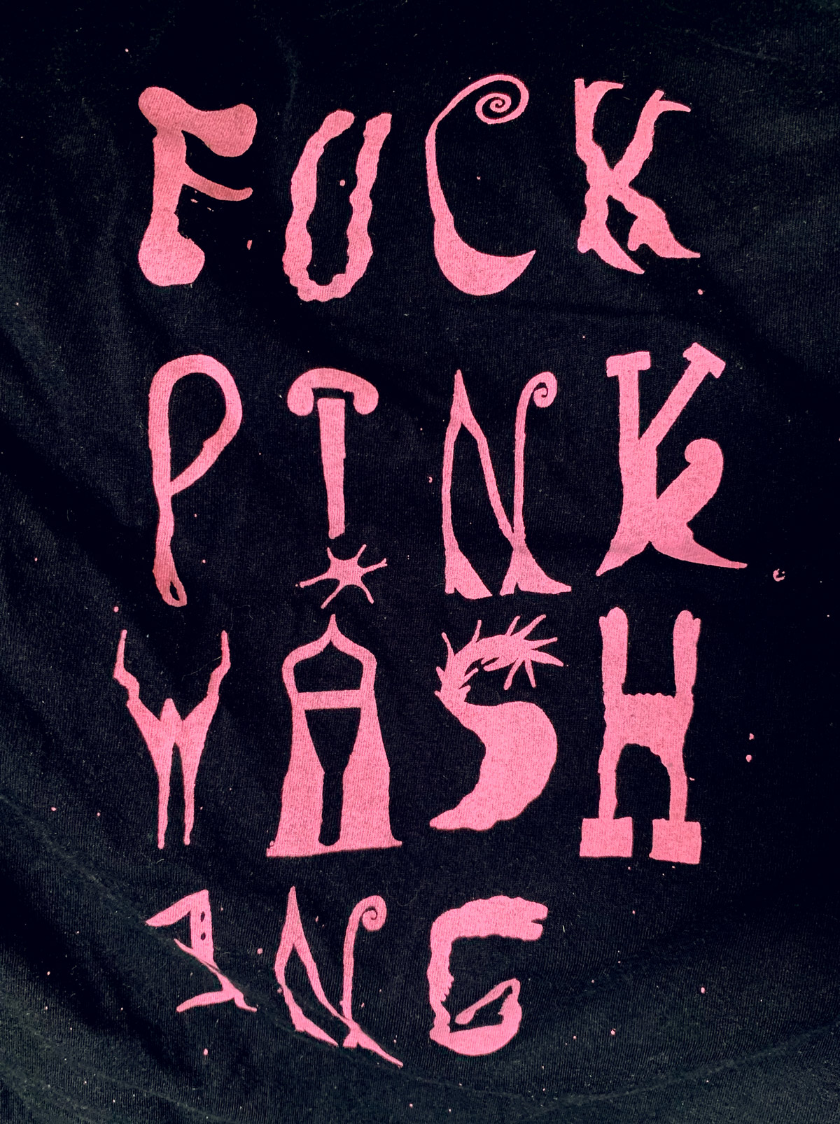
Mothers & Daughters – a lesbian* and trans* bar*
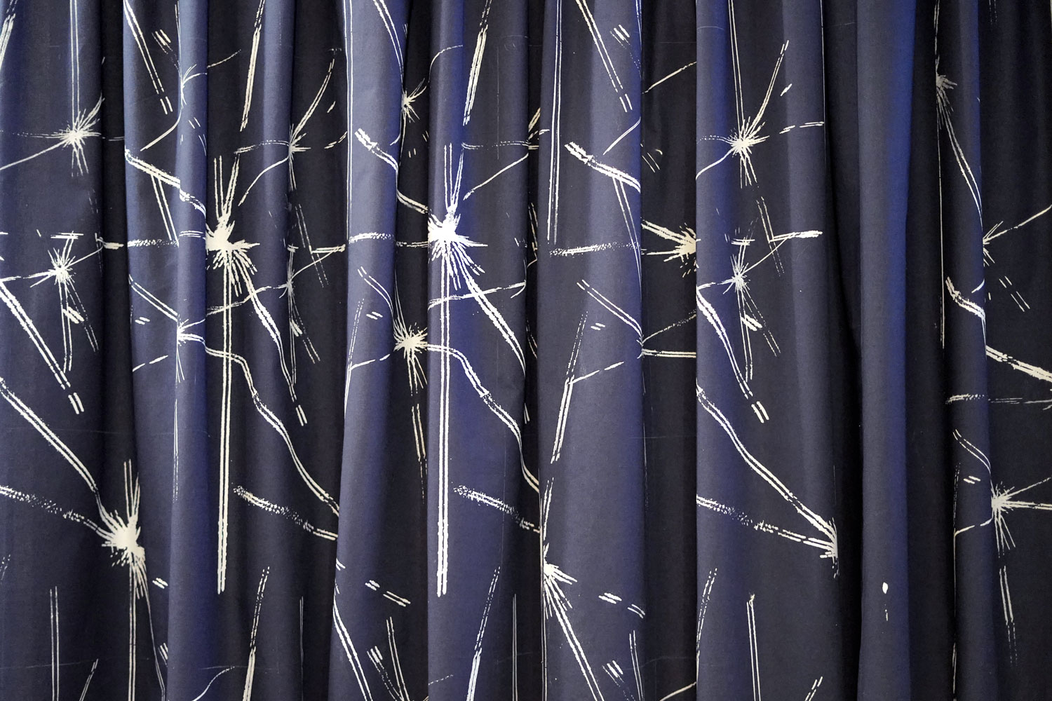
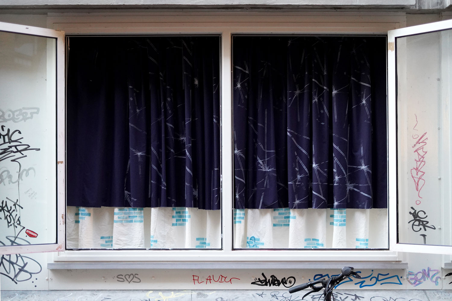
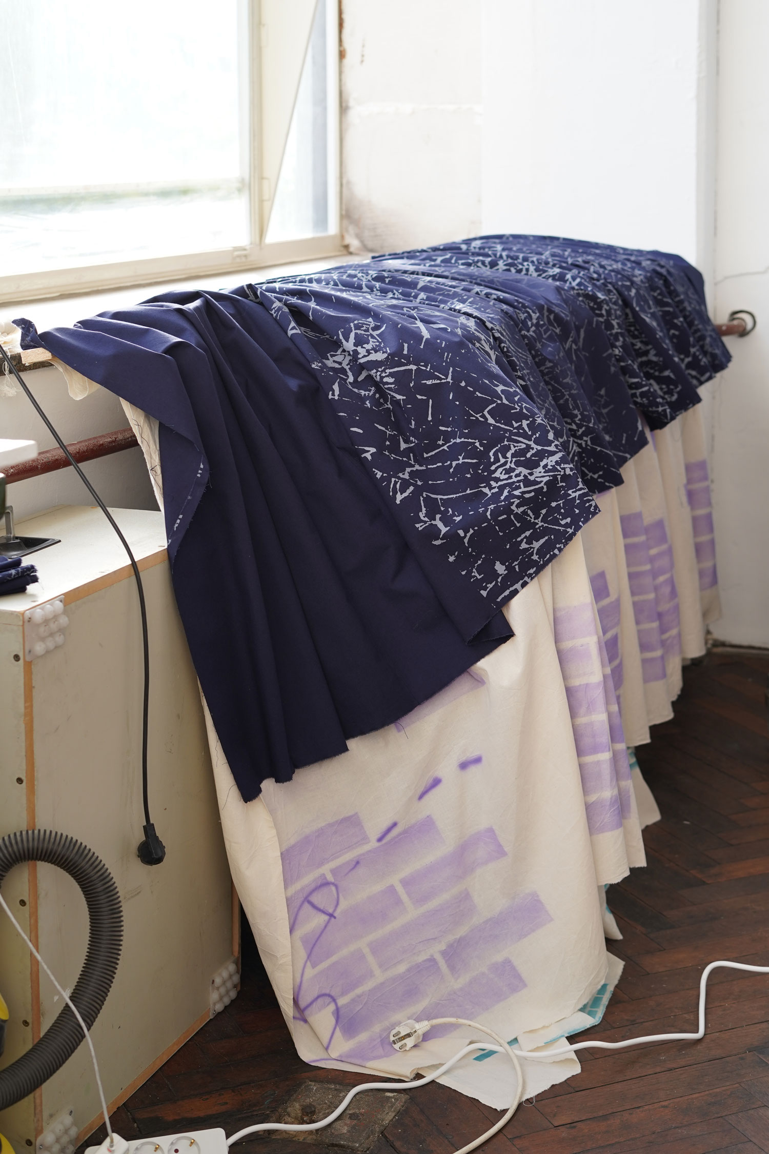
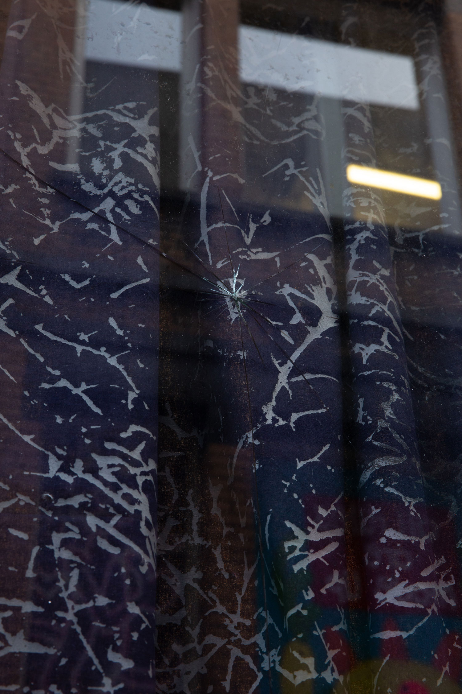
Poster Design
2026
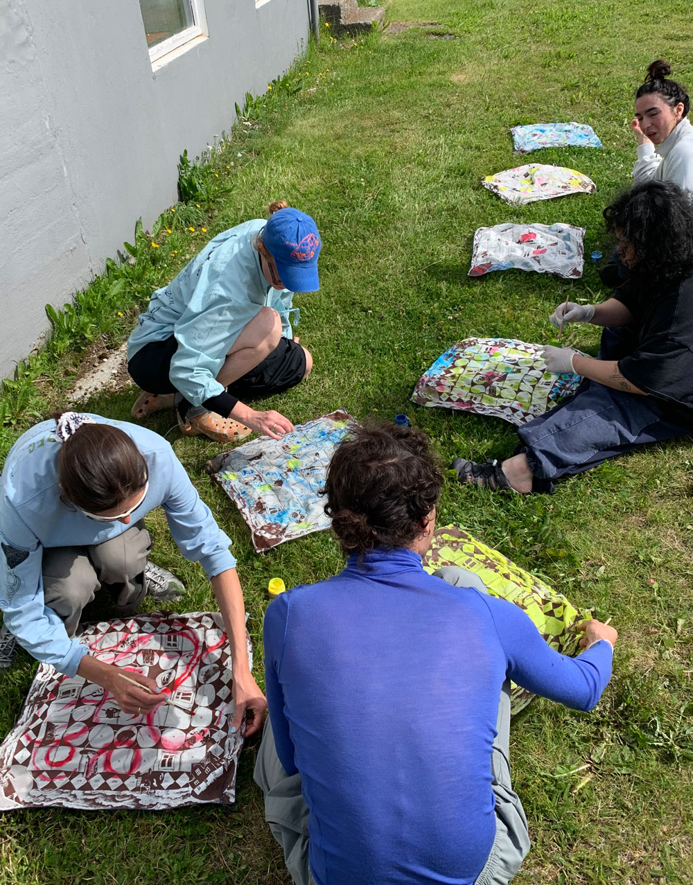
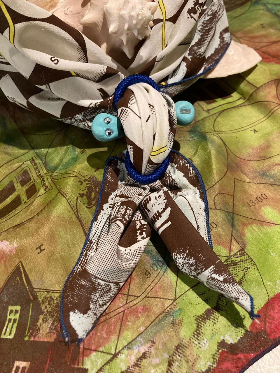
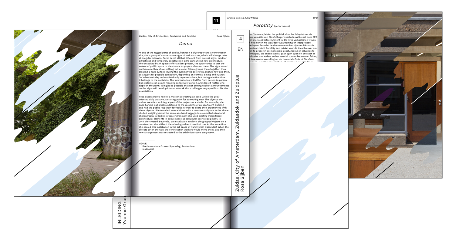
In 2017, Mothers & Daughters emerged from a series of events hosted by Girls Like Us as a lesbian (and since 2019 also explicitly a trans) bar and art space. Since then, Mothers & Daughters – A Lesbian* and Trans* Bar* has been creating community spaces for trans, non-binary, gender non-conforming and lesbian people in and around Brussels. Now, after nine incredible years—spanning four ephemeral bar appearances, two exhibitions, two signature brews and an epic array of workshops, festivals and events—our journey is coming to a close.
To honour this adventure and bring us all together one last time to celebrate your trans, non-binary, gender non-conforming and lesbian brilliance, and say goodbye (for now!), Mothers & Daughters returns to where it all began in 2017: Beursschouwburg. Expanding out from the original venue of the Beurscafé, this time we will occupy the full building, and welcome you to join us for an exhibition, workshops, a round table and book launches, DJs, films, performances, and, of course, discussion, hugs, gossip, smiles, dancing…